 copyright,
Kellscraft Studio, 1999
copyright,
Kellscraft Studio, 1999
(Return to Web Text-ures)
Little Gardens
Content Page
Click Here to return to
the previous section

(HOME)
|
copyright,
Kellscraft Studio, 1999
(Return to Web Text-ures) |
Click Here to return to Little Gardens Content Page Click Here to return to the previous section |
(HOME) |
|
IV
COLOR TAKING us as a people, by and large, our enjoyment of color is rather barbaric. We have no objection to a lot of it, and if the key is high pitched it does not keep us awake. We have held puritanical objections to liveliness, whether of color, music, speech, thought or conduct, but either we did not recognize it in tints when we saw it, or we are recovering somewhat of that youth of the eye that it had before Cromwell blacked it for us. We improve in taste as we grow younger, and the hope that penetrates far into the future sees, even in our streets, such splendors as were seen in Florence in its days of greatness. Flowers can be vehement, though they seldom are, for green is a delicious solvent that brings them into relation, and often into harmony: and, again, they are of a purity and transparency that softens them, even in contrast. If the hues of certain blossoms are a bit aggressive in the sun, we are to remember that we seldom see them in full light, and that the shadows of leaves, tree trunks and walls do much to tone down what else would be too shrill. Then, it is more severe upon us to turn a single ray of sharp red or yellow upon the optic nerve than to flood it with the same color. We resent little effects; we want broad spaces and masses; hence, it is not well to have a quantity of unrelated tints in your garden. A solid bank of marigolds, azaleas, or what not, is a comfort in its mere aspect; we bask in it, and seem to appropriate from its color some delicate material for the building of the spirit, even as physicians have discovered varying pathological values in reds, blues, greens, yellows, browns, grays and blacks--excitants and sedatives. In flowers we have every primary and secondary color, and many shades of each. May I be pardoned if I revert briefly to first principles. Light can be broken into three primary hues: red, yellow and blue. Mix any two of these and you have a secondary. Where
red overlaps yellow, it makes orange; where it
overlaps blue, it makes purple; where 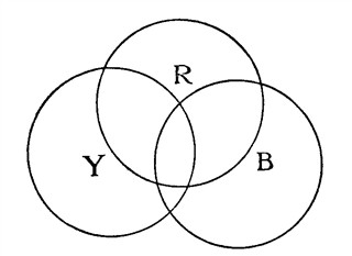 Fig. 24.
yellow and blue are blended, the result
is green. In these six we have the
rainbow, if you add that deeper blue we call indigo, on its outer rim,
and
that strange liver color which fills the space between the two arches
when
there is a double bow. No color is black. Where all colors blend we
have
the pure white light--if we use the spectrum, because if you mix
pigments
that way you have only a mess. We paint the earth when we plant
flowers,
but a charm of these little friends is the tender and ethereal quality
of
their color. A certain red in paint is thick and dull, but on the petal
of
a rose, peony or rhododendron it gleams like a jewel.
Nature does not enjoy a reckless mixing of tints. She softens her distances by toning them to blue, in harmony with the sky and sea; her universal green is the most restful and satisfying of all hues: with what splendid sweeps of her brush of sun-rays does she change our woods in autumn, and what lovely purples and violets we have when the blue of a few miles of air blends with the red of the oaks and maples! Our garden will be more rich if we treat it as the artist treats his canvas, and avoid harsh contrasts and tiny dabs of color. Sow yellow with a generous hand, and the earth will smile its content. Unless, to be sure, you are one of those who have an aversion to it, in which case, take another color. For myself, I find beauty in any tint, but I ask that it be used purely and be kept from jangling with every other. And the way to use it, is to use it largely and simply. The limits of a garden are so small that you may think you are forced to plant primaries side by side, and find that they jar a little. If you interpose a touch of that with which you want a color to harmonize the thing is done. For instance, you have a bed of red nasturtiums, and you wish to put some yellow flowers in the center or about the borders. Then use orange nasturtiums as blenders, for they contain both yellow and red. So long as you keep to one kind of flower you are in little danger from discords, because here again nature attests her esthetics and gives warrant for our own. For it is a well-known fact in botany that the flowers of any plant species will be restricted in their coloring to two of the primaries with, probably, the intermediate tint, that comes of hybridizing. For example, the rose rejects blue and keeps to red and yellow. It also adds white, for that does not commit the plant which elects it to the use of the third primary. The rose has almost every shade of red and pink; it has a gamut of yellows; it even threatens to blend these and produce an orange rose, but has gone no closer than a salmon tint, so far; but you will find no rose with a purple cast, for that would promise a divergence into the third and forbidden primary--blue. We shall probably never have a blue rose; at least, the labor of experts and centuries in the endeavor to produce one has come to naught. We should not care as much for it as for the rose of to-day if we had it, I dare say; at least, after the novelty had worn off. Taking another family, we find the same rule proved: the chrysanthemum is yellow, red and white, with blended hues, but never blue. In the aster, which it resembles, we have, on the contrary, no yellow, but red, blue and white, commonly the red tinged with blue and the blue showing a trace of red. In the sweet pea we have blue and red but faint yellow; in the azalea, red and yellow, but no blue; the canna and gladiolus exhibit various shades of red and yellow, but no blue; in the cineraria we have a lively exhibit of ruddy blues, but never a touch of yellow; the geranium has several shades of red, with a scarlet that indicates an admixture of yellow, but there is no geranium which sows a hint of blue; the bellis copies the color range of the aster, hence it is not yellow. There are a few exceptions; for instance, we have red, yellow and blue in the columbines; and the violet is both yellow and purple, the latter a mixture of red and blue; but these exceptions are just enough to prove the rule. If, however, we put flowers of unrelated families into close touch with one another we may perpetrate an inharmony now and then. Some boldly throw complementary colors together. A complementary, or opposite, is that color which is not contained in the complemented. Thus, red is the opposite, or complementary, of green, a compound of the two other primaries, and vice versa. If we look intently on yellow, then quickly turn away, or close our eyes, we shall see purple, that color representing the combination of those other two primaries which yellow is not; if we look away from blue, we shall be conscious of orange. Some ingenious pictures were published a few years ago called" Ghosts." One looked for half a minute steadily at a green rose with red leaves, and turning his head smartly looked into some shadowed corner, where after a few seconds, a phantom rose, of normal color, duplicating the form that he had impressed upon his eye, appeared, sometimes with surprising clearness. In the same way, the picture of a sheeted figure in black became a ghost in white when the observer looked away from the plate, and off into a darkened room, while a figure in white repeated itself in black against a white wall. These experiments account for a good many supernatural appearances, and are of physiological interest no less. But what the eye does as by mechanism is not of necessity a guide to that which we shall do with our hands. Complementaries when crudely juxtaposed, yellow with purple, and orange with blue, are apt to get to quarreling with one another when our backs are turned. Veiled and softened by air and shadow, nature's primaries, whether used with opposites or not, seldom clash disturbingly, but close at hand, in our home plot, it is better to harmonize than to contrast. The cooler and quieter colors fit themselves more easily to a miscellaneous company than do the gayer ones; indeed, we can make one rule suffice: to keep cool and warm colors apart, each in the society of its like. The scarlet of geraniums is acid, but it is less endurable when supported by a sharp, high green of the same "value," than when offset by a darker green. Put a glaring scarlet geranium alongside a bright blue flower of any sort, and there is liable to be a riot. Scarlet geraniums are rather intractable things, yet apparently the most popular of pot-plants. They are effective in borders and masses, but those of a rich China red, and of pink and white, are more agreeable and more generally useful. Complementaries make one another more intense. If we put the yellowish leaf of a nasturtium against the magenta of a cineraria, the former becomes more brilliant, and the latter more rich and solemn. But if we put a crimson rose beside the cineraria, and maybe, place a bunch of purple grapes before them, we should have three related colors and a harmony, eliminating, of course, the nasturtium leaf. If, on the contrary, we were to put the cineraria into a combination with a ripe orange and a bit of cloth of a bright blue-green--secondaries, all--we should have three semitones of a major chord, and semitones make discord when they are not separated. Flowers that have a tinge of blue, or red or yellow in common may be used safely. If it is, for any reason, necessary to bring colors near one another that are addicted to quarreling, use as pale tints of them as possible, because white is a wonderful quieter and sweetener, and separate them by green, or some medium tint, if they can be kept a little apart. Almost any color justifies itself when it is exuberant in quantity, yet the finer and softer tones of it win us, in the end. When in doubt, use white. That is safe with all colors. It does not make a harmony with them, any more than green makes harmony. We are to regard it rather as light. We can enjoy the effect of marble statuary, balustrades, urns, columns, stairs, curbs and walks in formal gardens, and the white of this stone grows the softer, yet the surer, for a backing or surrounding of somber yews and rhododendrons. It is pure and passionless and seems always to express engaging innocence, whether we find it in the rose, the hyacinth, the locust or the water-lily. I wish we were not so frightened by the possibility of it in our costumes, and did not confine it to varnished shirts, tin collars and boiler-plate cuffs. Every one looks well and younger in white, and nobody looks well in black. So, in flowers, white may not dazzle or surprise; it does not gratify the barbaric fondness for show; it is not sensational; but it is always welcome, always comforting; no less than green it expresses serenity and health. Click the Little Gardens Icon to continue to the next chapter.
|