
Web
and Book design,
Copyright, Kellscraft Studio 1999-2007 (Return to Web Text-ures) |
 (HOME)
|
|
CHAPTER
VI
DESIGN AND COMPOSITION For the general designer or decorative artist the designing of lettering does not mean the invention of new shapes for the letters, it means simply the selection of suitable styles and their composition into pleasing form. The general shapes were designed long ago, and it would be inordinate presumption for an artist to create a new alphabet and through his design to say to the public: "This is my letter, you must learn to read it." Mr. Lewis F. Day, the English designer and author, said:1 "There are two conditions on which the artist may be permitted to tamper with the alphabet: whatever he does ought, in the first place, to make reading run smoother, and, in the second, to make writing satisfactory to the eye." No real letter shapes are ever invented, they are all evolutions. The new work of the continental artists shows a freshness and variety and beauty of line, and an originality of design that may in some cases almost be called invention, but as has been said these men are working with an intimate knowledge of the historical forms. It is but natural that in the attempt at novelty some designs miss the requirement of legibility, and others that of beauty, some both; but such forms are not to be taken seriously. It is scarcely necessary to add here that lettering is essentially flat ornament, and that all the misguided attempts to make letters appear solid by adding shadows, by drawing them in perspective, or by making them of cobble stones or branches of trees like porch furniture, are eminently bad. The designer's problem is then to select the appropriate combinations and by arrangement and spacing to make a pleasing effect. In this there should be considered (1) the period, (2) the purpose, (3) the material. The period or general historical style of the other parts of the design or ornament must be noted, and the lettering must first of all be appropriate. Gothic letters for example would of course be out of place in a Renaissance or Barocco design. Similarly, if the lettering is predominant the ornament must fit the letter selected even if the ornament be only a border. 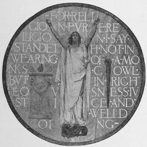 FIG. 95.—"RELIGION," by E. A. Abbey. Copyright 1908, E. A. Abbey From a Copley Print, Copyright 1908, by Curtis & Cameron.  FIG. 96.—Bronze Tablet, by T. E. F. On page 72 the letters discussed in Chapter V, and some of their appropriate uses have been set forth in tabular form and may be studied with profit in connection with the choice of letter combinations. The purpose of the inscription is again an important consideration in the selection of the style. Examples will readily suggest themselves, but the key-word again is appropriateness. Clearness and legibility are of course fundamental conditions, but these are relative terms; they do not necessarily mean the property of being read at a glance, what Dr. v. Larisch calls brutal legibility. The legibility of a sign or advertisement is not necessary nor even desirable in lettering used as ornament. Beautifully designed ornament assumes that the observer has time to examine it and enjoy its detail. An extreme example is shown in Fig. 95, a reproduction of one of the late Edwin A. Abbey's four medallions (Art, Science, Justice and Religion), in the Pennsylvania State Capitol. Mr. Abbey, one of the greatest of modern painters was at the same time the greatest master of lettering in decoration. Not since Albrecht Dürer has there been a great master so familiar with the details and the beauties of lettering.
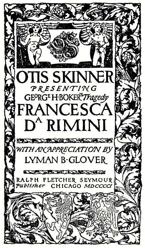 FIG. 97.—Title Page, by Ralph Fletcher Seymour.
The backgrounds of these medallions have not the legibility of an advertisement, indeed at first sight of the originals one does not notice the lettering at all.  FIG. 98.—Roman, by Dard Hunter. 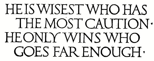 FIG. 99.—Roman, by W. A. Dwiggins.
The material upon which the lettering is to be done must of course be considered. In stone it is the shadow and not the outline that defines the letter (page 40); the same is true to a lesser extent in wood or bronze, or other materials where the surface of the letter is the same color as the background. Stubborn materials such as beaten silver or copper, or cast metals, cannot have the same delicacy of design as engraved metals. Rough paper demands bolder treatment than smooth paper. Letters for needlework, or leather, or stenciling must be designed strictly with reference to the surface and texture of the materials used.  FIG. 100.—By Rudolf Melichar. (Larisch.) When these three points have been considered the designer will begin his problem. After deciding upon the general form of the space to be used he will write out the inscription roughly, selecting the important words or lines for emphasis by size or position, and will make a number of miniature sketches, not more than an inch or two in height, for composition. This arrangement of the relation of white and black is the important step, and the full size drawing cannot be started until a satisfactory scheme of composition has been determined. 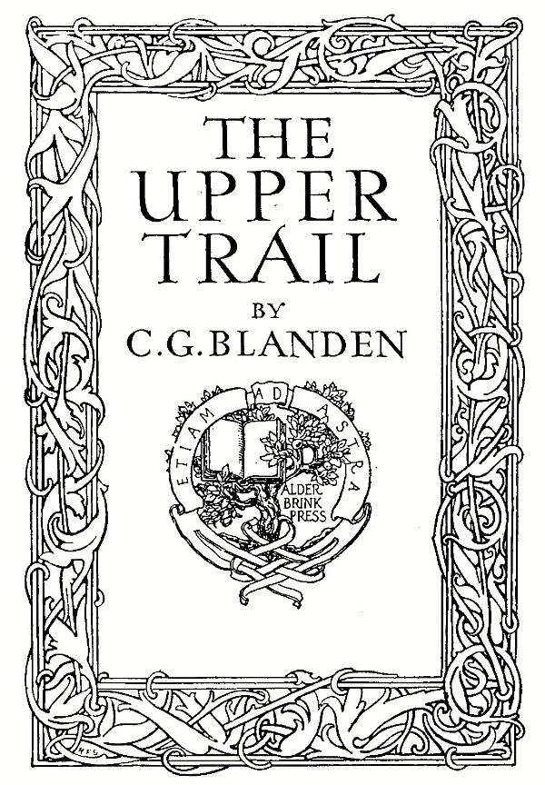 FIG. 101.—Title Page, by Ralph Fletcher Seymour. 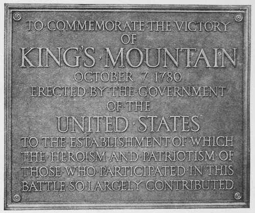 FIG. 102.—BRONZE TABLET, designed by McKim, Mead & White, Archts. Courtesy of Jno. Williams. Inc., N. Y.  FIG. 103.—Cover Design of "AN UNOFFICIAL LOVE STORY." Published by the Century Co., N. Y. When the design in the little sketch seems to be balanced and harmonious the final drawing should be laid out carefully in the same proportion, penciling top and bottom guide lines for each line of letters very lightly. If the design is symmetrical the method of procedure will be as given under the head of title designing on pages 35 and 36, working from the center line, and shifting letters and lines until the desired effect is obtained. If the design is unsymmetrical or massed, suitable treatment will suggest it- self, but in every case the copy should be written down in the adopted arrangement and the letters counted for the approximate spacing.  FIG. 104.—By W. A. Dwiggins. The artist using letters in design is assumed to know the laws of design and will follow the same principles in the lettering as in any other part of the design. It is, however, more difficult to bring letters under these laws than landscape or figure composition. When one has become a master of the letters he may use them to form ornament, but it is safer for the amateur to preserve the historical forms and put his ornament on the background. On account of the varying widths of Roman letters it is sometimes difficult to space a word to a given length by counting letters from a center line. Fig. 105 illustrates a method of spacing, on the old principle of similar triangles. Suppose it is required to put the word PROBLEM on the line and to the length ab. A line ac is drawn from a at any angle, another line de drawn parallel to it and the word sketched in this space, starting at a and spacing each letter with reference to the one before it, allowing the word to end where it will. The end of the last letter (at c) is connected with b and lines parallel to cb drawn from each letter, thus dividing ab proportionately. The proportionate height of bf is obtained from ce by the construction shown, after which the word can be sketched in its final position. After one has become familiar with the letters the line ac only need be drawn and the proportionate widths marked on it starting at a as in the word "SPACING." The final adjustment will be secured only after each letter has been adapted perfectly to its surroundings, with the areas of space so balanced that no gaping whites nor spots of black mar the effect. Do not hesitate to erase a whole line if it is felt that shifting it even a sixteenth of an inch would improve the design. 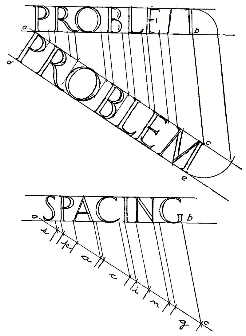 105.—Method of Spacing to Given Length. At this stage the trained designer can see clearly the exact appearance of the finished drawing; the beginner is often surprised at the difference in effect when the letters are inked, and solid black has taken the place of the gray pencil outline. This part of designing cannot be taught, it is gained only by experience. If the work is a drawing for reproduction, a printed cover page for example, a full size sketch on paper of the same color and texture as that to be used in the printing is a great aid in studying the effect before making the final enlarged drawing for the engraver. Suggestions on drawing for reproduction will be found in Chapter VIII. Book covers in cloth are printed with brass stamps, and the drawing, made to finished size in color on smooth binder's cloth, of the selected shade, is often sent for the die-cutter to work from. Designs for execution in stone or bronze are made full size in pencil only, on detail paper or tracing paper and from this transferred to the material. Fig. 106 is an alphabet designed with Japanese characters (there is no real alphabet in that language), for which occasional appropriate use may be found in connection with Japanese design. It may be used in vertical panels. The two fillers on the last line are the well-known symbols, or words, for "good luck" and "long life." 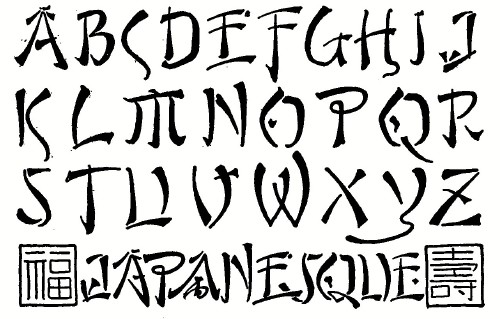 FIG. 106.—A Japanese Suggestion. The
following page gives a summary, in tabular form, of the letters used
in design, with suggestions as to the appropriate uses for each
style. The characteristic designation given to each may seem
fanciful, but it is simply an effort to "personify " the
styles and to aid in giving that sympathetic acquaintance which the
successful designer must feel.
To attempt to go into detail in any of the branches of design in which lettering is used would carry us past the limits of this book. The lettering on a book-plate for example is really the most important part of it, but the design of ex libris is a subject in itself. Fig. 108 is a book-plate in which letters have been used as design.  FIG. 107.—By R. F. Seymour. Another special subject into which we cannot enter is the art of illuminating, which may be defined as the brightening of a page by the use of colors and gold and silver. As an art it flourished throughout the Middle Ages, and naturally declined after the invention of printing. In the present revival of lettering, when the beauty of the hand-written page is appreciated more than at any time since printing was invented, the "Art of Illuminating" is coming again to a rightful place among the arts. Beautiful things may be done easily by the student of lettering, on vellum, parchment, Japan papers or even "cover papers," by designing a page of writing, usually in Gothic or Roman lower-case and illuminating the initials and border. In the simplest design it would mean only the boxing of the initials as in Figs. 55 and 65. Real illuminating always implies the application of metals in addition to color. Pure gold, burnished, should be used, either in the form of shell gold, or leaf. Gold and silver bronzes are useful only for temporary work. The student wishing to go into illuminating is referred to the books mentioned in the last chapter, particularly to "Writing and Illuminating and Lettering," by Edward Johnston. It is recommended that the student in practicing lettering for application in any branch of design do not simply copy alphabets, but that he set a definite problem, as a book cover or title page, and gain from it not only knowledge of the letter forms, but experience in the far more important part, the composition. The figures in this chapter are given to illustrate good design and composition in a variety of subjects, and should have careful study.
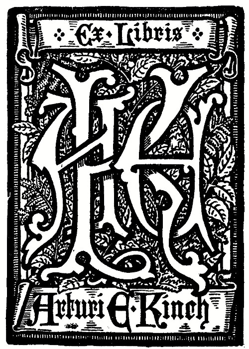 FIG. 108.-Book Plate by Thomas Moring. From "One Hundred Book Plates."
_________________
1 Alphabets Old and New. |


 Click the book image to turn
to the next Chapter.
Click the book image to turn
to the next Chapter.