
Web
and Book design,
Copyright, Kellscraft Studio 1999-2007 (Return to Web Text-ures) |
 (HOME)
|
|
CHAPTER
V
LETTERS IN DESIGN The preceding chapters were written for those students and draftsmen who use lettering only as an adjunct to the "graphical language" of their office drawings. Lettering in design is a far wider field. Here the designer uses lettering not only to make a statement—to convey information by the written words—but for its own inherent beauty of line and composition. He uses it with his ornament, he uses it as ornament, to break a space or to fill a background. The artist or decorative designer must then not only be familiar with the fundamental forms explained in the previous chapters and the rules upon which they are based but must have at his command other historical and modern alphabets and know the appropriateness of each for its place. In this chapter the principles and peculiarities of the useful letters of different styles and periods will be considered. THE OLD ROMAN Referring to the historical outline of Chapter I it is remembered that the Old Roman is the parent of all the styles, and beyond all comparison the most useful letter for the designer. It will be used oftener than all other styles together, and it is safe to recommend that the student when in doubt use Old Roman. The Old Roman letters have been discussed and analyzed in Chapter II and it will be the first duty of the designer to become thoroughly familiar with these forms. An early form is shown in Figs. 1 and 5, and some Renaissance forms in Figs. 6, 9 and 10. These are monumental forms of classic beauty and dignity. As a pen-drawn letter the Old Roman admits of much freer treatment, and in composition not only the position, but the size and shape of each letter is considered with reference to the adjoining letters. They must not be tortured out of shape nor driven to do things they do not want to do, but once the artist has that real feeling of personal acquaintance and familiarity, the letters can be coaxed into doing almost anything he wishes them to do. The lower limb of a letter may be extended and the following letter, a vowel usually, perched on it, the swash lines of the R and Q may extend almost indefinitely, the top of a T may reach above the guide line and allow letters to play under it, two letters may have a common stroke, round letters may be linked together, serifs may run into each other, and feet may be shortened or lengthened, all easily and naturally if the designer be on sufficiently intimate terms with the family; but the Roman in its dignity resents any such familiarity from a stranger. To make a letter larger or smaller than its fellows with no more apparent reason than the desire for oddity is pure affectation.
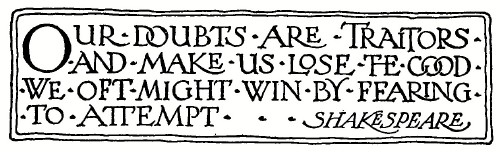 FIG. 51.—Freedom in Composition.
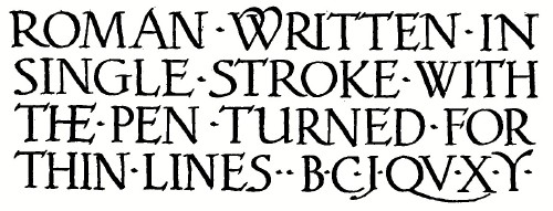
Fig. 51 illustrates something of the freedom referred to. Old Roman letters should not be stretched out in extended form, but the spaces between the letters maybe increased indefinitely. They may however be condensed if lack of space demands it. In condensing, the straight line letters and narrow letters may be compressed up to the limit before the O family have been squeezed out of round. The expedient of using common strokes in monogram-combinations, and of linking the round letters will often save the required space. Fig. 52 is an extreme example. 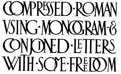 FIG. 52. For careful work in design the Roman is to be regarded as a drawn letter, to be outlined and finished as has been described. It may however be written effectively, after the manner of the old scribes, in single stroke with a broad pen, such as those of Fig. 72, tilted at a slight angle as shown in Fig. 53 and turned for the thin lines of M N W, etc. The figure shows also the little extra stroke used to form the fillet.  FIG. 53.—Broad Pen Roman Construction. After the forms of the letters have been learned it is surprising how they almost shape themselves when done in single stroke with the broad pen. Larger letters are built up of two strokes for the body mark, and for very large ones the full stroke of the pen may be made for the thin lines. If a reed pen is used it may be cut either square across or at a slant, to fit the hand of the writer. Its corner may be used for such touches as serifs on horizontal lines, etc. Large Roman letters may be made easily and rapidly in single stroke with a flat sable brush held in the same position as the pen.
 FIG, 54.—Broad Pen Roman.
ROMAN
LOWER-CASE.
The so-called Classic forms of the Old Roman consist only of capital letters, and in titles, inscriptions, and designs calling for stateliness or dignity of composition capitals would be used throughout. A paragraph or page of solid caps, however, is not easily read, as we read words by their shapes and are accustomed to these shapes in lower-case letter combinations, hence in longer sentences, quotations and the like, a less formal effect and at the same time greater legibility is secured by using caps and lower case.
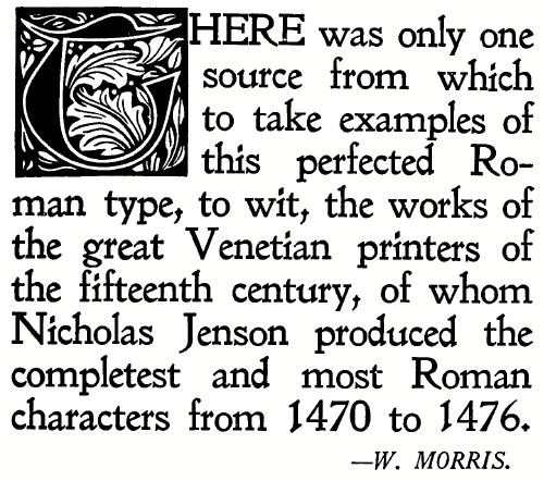 FIG. 55.—Jenson Type. Referring again to the history, the Roman lowercase letter was the final step in the evolution from the Caroline, and reached its definite form after the invention of printing, so for models to combine with our Roman capitals we go back to the type forms of Jenson and the master printers of the fifteenth century. Type degenerated so steadily after that period that William Morris once exclaimed, "There has not been a decent book printed since the sixteenth century."
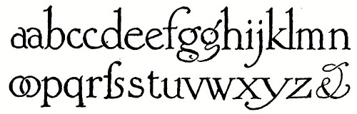 FIG. 56.—A Roman Lower-case. But we have the same freedom in our pen-drawn small letters as in the capitals, not being limited by the size of the type body as are the printers, and can extend lines or combine shapes, giving an individuality to the lettered page impossible to the printed one. It is no compliment to a designer to say that his lettering looks like print. It should look much better, or at least very different.
 57.—Broad Pen Lower-case.
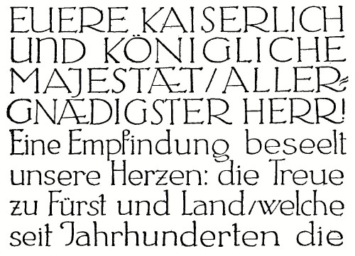 FIG.
58.—A Light Face German Example.
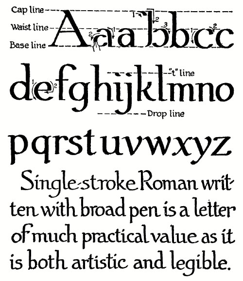
The body letters are made from one-half to three-fifths the height of the capitals, with the ascenders equal to the caps and the descenders slightly shorter. Much care and judgment must be exercised in having the small letters "fit" the caps; the usual fault is in getting them too light. The strokes will be thinner than those of the caps but are not reduced in the same proportion as the heights, and the bodies of the letters will at the same time be a little wider in proportion than the corresponding capitals. The principal difficulty in drawing lower-case letters is in keeping the page to a uniform color. The simplest spacing for a page of lower-case composition is to divide the space between base lines into three equal parts, making the caps and ascenders two-thirds and the bodies one-third, as shown in Fig. 57. The dots on the i and j are on the "t line" which is half-way between the " waist line" and the "cap line."
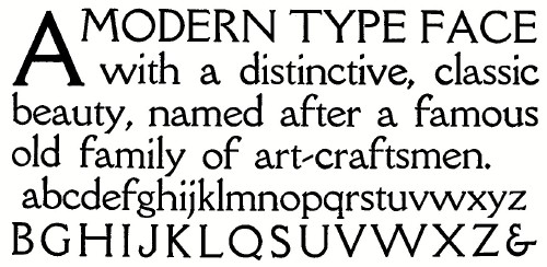 59.—Della Robbia Type. The letters of Fig. 57 are written with a broad pen held in the same position as for the single stroke capitals, turning it when necessary for such letters as the w. Much practice must be spent in composition, with careful study of good examples, before satisfactory results with lower-case can be obtained. Fig. 55 is a once popular type face, Fig. 56 a free pen-drawn style, Fig. 58 a light face letter from Dr. von Larisch's "Unterricht," and Fig. 59 a modern type-face of classic beauty. The examples of printer's type are given as carefully studied examples of the individual letters. Their composition is not to be copied. Far less is the writer to try to imitate their regularity. The charm of the lettered page is in its freedom and individuality. THE
UNCIAL
In historical order the next letter for the designer is the Uncial, although it is the later or Lombardic form that is of particular value and interest. There is not in this letter the fixed form of the Roman. It has many and wide variations developed by different scribes and in different countries, but its general characteristics are easy to remember and the letter is not difficult to draw. These letters are sometimes called Versals from their use on the manuscript page to indicate the beginning of a section or paragraph.
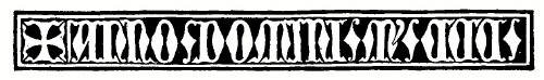 FIG. 60.—From a German Bronze. 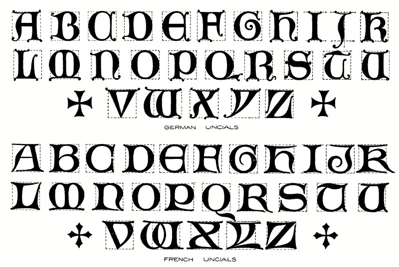 61.—Two Practical Uncial Forms. 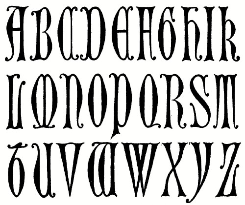 Fig. 62.—Compressed Uncial. 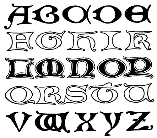 Fig. 63.—Extended Uncial.
Several practical working examples are given in the accompanying figures. The upper alphabet of Fig. 61 was drawn from German bronzes, and the lower adapted from French sources. The normal square proportion of these alphabets may be compressed as in Fig. 62 or extended as in Fig. 63. Fig. 64 is an American type form of pleasing design. Fig. 65 contains suggestions for treatment of ornamented initials, drawn from various sources. Much of the charm of such work, however, lies in the color, which cannot be indicated in black and white. The Uncial bodies may be made successfully in single stroke in the same way as the Roman letters, drawing the finer lines with the corner of the reed, or with a finer pen.
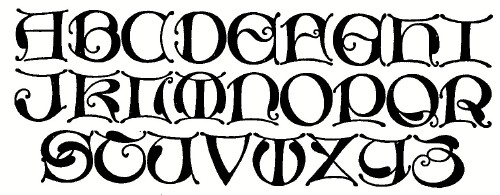 FIG. 64.— Missal Type. The Uncial may be used in all caps, although some regard must be had for the reading public's lack of familiarity with it. It is appropriate in ecclesiastical work or with any Gothic design, and is of particular value for initials, and as caps for Gothic lower-case letters. Lines of Uncial should be kept close together, always closer than the height of the letter. Fig. 66 from the shrine of St. Simeon illustrates the extreme of this close spacing, and Fig. 67 is a single stroke modern example that is well spaced.
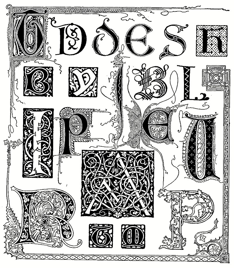 FIG. 65.—Ornamented Initials from Manuscripts. 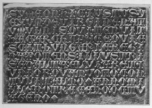 FIG. 66.—Embossed Silver, 1380.
THE
CELTIC
The Irish half-uncial of the sixth and seventh centuries, known in design as Celtic, is a style that has been used recently with good effect. Many of its forms are obsolete and must be modified to be decipherable, but it has a primitive strength that combines well with the characteristic spirals and interlacements of the ornament of that period. Fig. 68 is a working alphabet adapted from the Book of Kells and Fig. 69 is an example showing its derivation from the Celtic, by Mr. Dwiggins, one of the artists successful with this style, and whose work for Mr. Alfred Bartlett, the publisher, is well known.
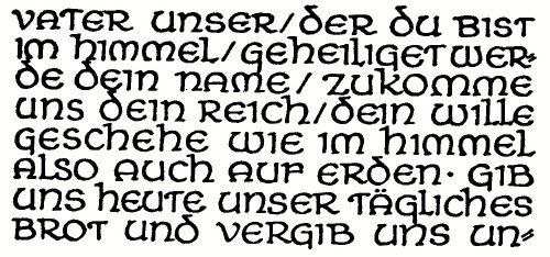 FIG. 67.—From Dr. v. Larisch's "Unterricht." 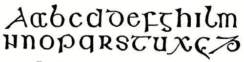 FIG. 68.—Celtic Alphabet. Book of Kells.  FIG. 69.—By W. A. Dwiggins.
THE GOTHIC The general term Gothic is given to the manuscript letters of the eleventh to the fifteenth centuries. They are essentially "written" letters made with one stroke of the pen, as distinguished from Roman and Uncial which may be called " drawn" letters. Their lowercase changes from the Round Gothic1 following the Caroline, to the pointed Gothic or "blackletter" of the twelfth and following centuries. The blackletter as a printing type was gradually displaced by the Roman, and by the seventeenth century Germany was the only country still using Gothic. As is well known that country now uses Roman for scientific publications, but adheres to the illegible German Fractur as the popular type. 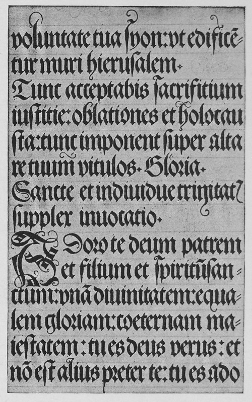 FIG. 70.—Gothic Page by Albrecht Dürer, 1515. The letter generally known as Old English is to the ordinary reader the most familiar style of Gothic. Its bristling angularity shows it to be a late form. The capitals of these later forms become more complicated and weak in design, and their only advantage is that in such work as engrossing they may be made without changing the direction of the pen. For all good design the stronger Uncial caps should be used with the Gothic lower-case. One absolute rule must be observed—Never use all caps in Gothic. The Gothic is written with a broad pen tilted about 45°. Either a reed pen or a steel "round-writing" pen may be used. The steel pens, of which the "Sonnecken" are the best, are usually sold in sets of eleven numbered in half sizes from 1 to 6. When used alone they will only carry sufficient ink without blotting for one or two strokes. A brass clip is sometimes sold with them, but a more satisfactory ink holder may be made of a rubber band added as shown in Fig. 72. The ink is filled behind the rubber on the under side of the pen. 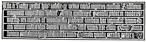 FIG. 71.—A German Bronze, 1514. (Weimar.)
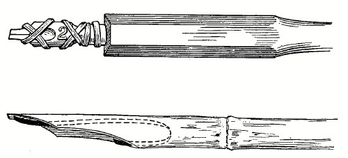 FIG. 72.—Steel and Reed Pens, with Ink Holders. The reed pen is much more comfortable, as well as better artistically. It is cut to shape with a sharp penknife or narrow blade surgeon's scalpel and an ink holder of annealed watch spring bent and inserted as in Fig. 72. English or Japanese reeds are the most satisfactory, although those from India are thicker and harder. Quill pens made from the wing feathers of turkey or goose are sometimes used for smaller writing, but the average student has more trouble cutting a quill than a reed. The pen is held as illustrated in Fig. 73, and the whole secret is to maintain this position and angle throughout, whatever the direction of the stroke. The first practice should be the drawing of the elements in Fig. 74. When these are mastered lettering in Gothic will be found to be easy and interesting. Select a pen as large as No. I 1/2, rule guide lines three-eighths of an inch apart (ordinary ruled writing paper will serve very well), add some vertical direction lines and practice stroke z until it can be made confidently, always vertical and with its ends cut off clean at 45°. 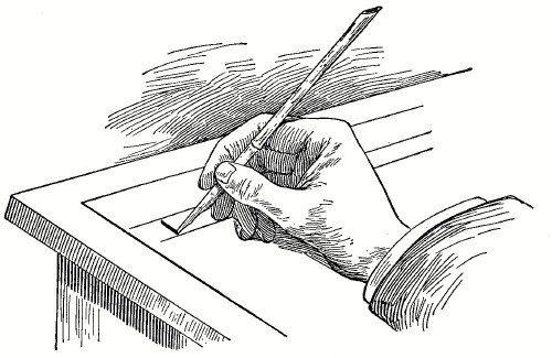 FIG. 73.—Position for Gothic Writing. 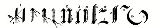 FIG. 74.—Practice Strokes for Gothic Writing. When this motion has been mastered, practise the strokes numbered 2, 3, 4, 5, 6, and 7, which are the elements of which the small letters are composed, then combine them into letters as shown in Fig. 75. The terminal blocks on the lower end of such letters as the "i" are squares, made by lifting the pressure from the pen, and setting it back as shown in Fig. 74, and the spikes of the angles, if used, may be made with a little side slip of the pen while the stroke is being made. In combining these letters into words the one requirement is to keep the letters close together, the space between letters wherever possible being just the same as the space between strokes of the letters, which in turn should not be much if any more than the width of the stroke. A printed page of text letters is always unsatisfactory, because the letters cannot be set sufficiently close, and because of the machine-made exactness. It lacks the irregularity and spontaneity of the written page.
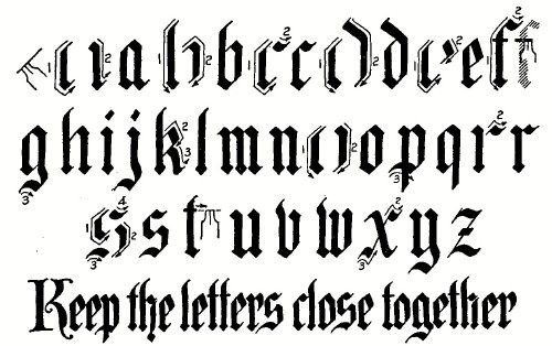 FIG.
75.—Analyzed Gothic Lower-case.
An alphabet of round forms similar to those used in Fig. 70 is given in Fig. 76. The order of strokes will be evident after practicing the angular. On account of the variety in combination this letter makes a more interesting page than the angular form. The uncial capitals have already been recommended for use with the Gothic lower-case, as being much stronger in design than the Gothic capitals, but several forms of the latter are given in Figs. 79, 80 and 81 and the order of strokes for the typical letters is shown in Fig. 77. They may be made with the same pen as the small letters, making the small letter three-fifths to two-thirds the height of the capitals.
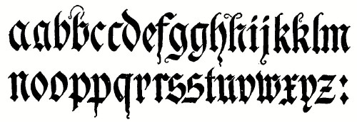 FIG. 76.—Gothic Alphabet. (After Mixer.) If the capitals are arranged in their family groups, their forms, which appear complicated, can be remembered without trouble. In the O family the C is the foundation letter, and from it the G, 0, Q, T, and one form of E, U and W are developed as shown in Fig. 78. Similarly B, H, I, K, L and R are closely related, all having the same beginning strokes.
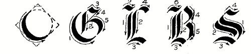 FIG. 77.—Typical Gothic Capitals Analyzed. The alphabet of Fig. 79 is a usual form of Old English. In this the spikes, hairlines and flourishes are added with a fine pen after the page has been written. Fig. 80 is a simpler form, written without retouching, and suitable for rapid engrossing and similar work.
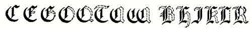 FIG. 78.—Family Groups. Fig. 81, adapted from the tomb of Richard II, is a letter of much beauty, and popular among designers, although not so well known and consequently not so legible to the general reader.
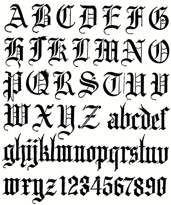 FIG. 79—"Old English"
Fig. 82 is an old form of Fractur or " German Text," which may be of occasional value. The paramount desire in the use of Gothic in design is for blackness, i.e., richness and "color," in effect. Words should be separated only enough for legibility, and lines not spaced widely. Short lines are often filled out with space fillers of spots or running figures to avoid any white "holes" on the page.  FIG. 80.—For Rapid Work.
Flourishes on the ascenders and descenders are characteristic of the later Gothic, and may be used judiciously with good effect. The Gothic is essentially a letter for ecclesiastical and other serious work, and its misplaced or inappropriate use is a grave mistake.
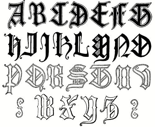 FIG. 81.—English Gothic. (Westminster Abbey, 1400.) Although Gothic is easier than Roman, it is worse maltreated by amateurs and inexpert designers, and impossible things in initials and designs are accepted as good or allowed to pass, where equally poor Roman would be immediately condemned. The beautiful letters of Albrecht Dürer, Fig. 70, are worth careful study. In the original, which is twice the size of this reproduction, the initial and the two lines just above it are in red, as are also the spacing lines.
 FIG. 82.—Old "German Text."
ITALIC
AND SCRIPT
Thus far all the letters considered in this chapter have been upright forms. In the period of the Italian Renaissance some of the historians and scribes, probably from the habit of writing fast, acquired a slanted writing, which became much the fashion. When Aldus Manutius in the sixteenth century cut the first font of inclined type he selected a carefully written manuscript of Petrarch from which to model it. In its stiffest form now Italic is simply an inclined Roman, such as Fig. 36.
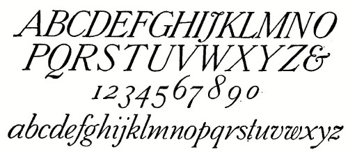 FIG.
83.—Italic.
Script, in lettering, is a freer inclined or sometimes vertical letter showing its origin from the cursive or written form. For the designer the so-called French Script of the period of the Louis, a letter full of quaintness and grace is most interesting and valuable, as it admits of a freedom of treatment that gives individual swash lines which often tie up with each other and with the ascenders and descenders of the small letters; but the curves must be spontaneous. A labored effect is fatal.
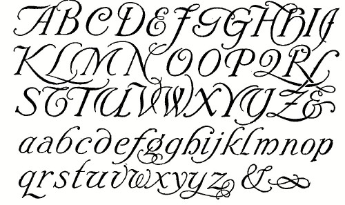 FIG. 84.—French Script. A general rule has been stated that styles of different slopes should not be used together. The notable exception to this rule is in the case of Old Roman and Script used in combination in what is sometimes called Colonial Composition, when the Roman is used for the display words and Italic or Script for the less important words and lines. Fig. 97 by Mr. Seymour, is an artistic example.
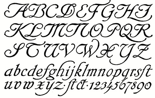 FIG. 85.—Script, by Rudolf Koch. Italic and Script may be used in all caps or caps and lower-case. In practising inclined letters such as Figs. 83, 84 and 85, slant direction lines should always be drawn as explained on page 27. The angle of slant varies widely both in historical and modern examples and is a matter of individuality. Some are only a few degrees off the perpendicular, others are nearly 30 degrees. The 2 to 5 slope mentioned on page 25 is a pleasing average. If the Roman has been well mastered, the italic letter will not be difficult, but the script will require much practice, probably with discouraging results before the curves will come smoothly.  FIG. 86.—Script, by Heinrich Wieynk. (Larisch.) The heights of the lower case letters are made in the same proportion as the upright lower case, but their widths are somewhat narrower. There must be careful discrimination and restraint in order that the flourishing shall not be overdone. Fig. 103 is an appropriate and clever example of script in design. "ART NOUVEAU" Under this general head we have classified all those variations which have been developed in the modern school of "secessionists," particularly in Germany. Using the old forms as a basis a new life has been given them in their adaptation in the characteristic style of those artists, who appreciate so thoroughly the value of letters as ornament. 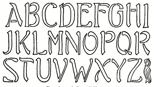 FIG. 87.—A Stencil Form. The apparently free or formless character must not be taken as a license for carelessness. The lines of the letters have been studied with the same seriousness as te apparently free lines of the characteristic ornament of this school, which have their "points of interest" and rules of composition definitely established. In range these modern letters extend from forms but slightly modified from the historical, through forms of good design but not so easily legible because of their newness and one's consequent lack of familiarity with them, to weird conceptions inspired only by the wild desire for novelty.
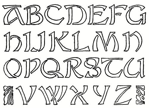 FIG. 88.—A Stencil Form. (After Grasset.) 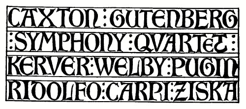 FIG. 89.—An Uncial Adaptation. (After Otto Hupp.) 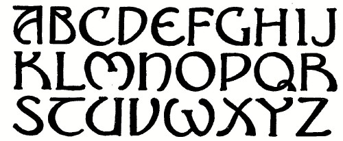 FIG. 90.—A Free Uncial Adaptation. 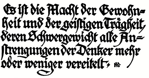 FIG. 91.—Gothic, by Rudolf Koch. (Larisch.) 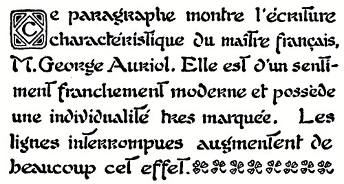 FIG. 92.—In the Style of George Auriol.
The modern forms of real value are all designed with an intimate acquaintance and regard for the historical forms. Figs. 87 and 88 are modern adaptations of Roman in stencil form, Figs. 89 and 90 show their derivation from the Uncial, 91 is a modern Gothic and 92 a cursive or script form. Fig. 93, an original alphabet by Mr. Hunter of East Aurora, is strongly Viennese. It is shown in composition in Fig. 98. The tall letter of Fig. 94 is a good practical form which works well in monograms and marks.
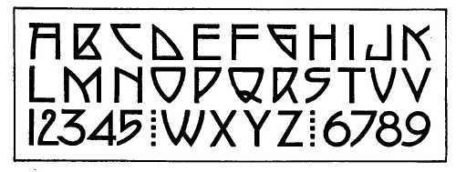 FIG. 93.—By Dard Hunter.
The "new art" letter naturally suggests itself for application in modern craft work in metals or leather, in carving, stenciling or needlework, and in posters and advertising, but its adoption in any design must be considered carefully. An inappropriate use will be offensive, and sometimes even a correct and appropriate use will be criticized by persons who although possibly incapable of judging, feel that they are being imposed upon.
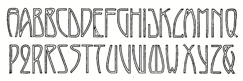 FIG. 94.—A Compressed Form.
________________________
1 The name proposed by Mr. De Vinne. |
 Click the book image to turn
to the next Chapter.
Click the book image to turn
to the next Chapter.