
Web
and Book design,
Copyright, Kellscraft Studio 1999-2007 (Return to Web Text-ures) |
 (HOME)
|
|
CHAPTER
VII
MONOGRAMS, CIPHERS AND MARKS One of the severe tests of a designer's skill and originality is in the design of letter combinations in monogram or cipher. It requires not only knowledge of the laws of design, and intimate and sympathetic acquaintance with the letter-forms, but a certain ingenuity and inventive ability—a power to devise combinations where none are evident. A monogram, strictly speaking, is a combination of two or more letters in which a part of each letter forms part of another. It is common to speak of any combination of interwoven or superimposed letters as a monogram, but if each letter is separate and complete such devices are not really monograms, but ciphers; and although usage and even some dictionary definitions have sanctioned the broader use of the word, we shall make the distinction, mainly for convenience in reference. As a rule the designing of a monogram requires more ingenuity than a cipher, and is consequently more interesting as a problem, but the result is often not as pleasing as a well designed cipher. A mongrel combination of the two, in three letter designs, in which two of the letters are monogram and the third a separate letter is, however, to be avoided if at all possible. It should be pure monogram or pure cipher. In this distinction it should not be understood that a monogram is better than a cipher as a design. The device is for ornament, indeed is ornament and an essential requirement is beauty. It is very often true that a given combination of letters cannot be made into anything but an ugly monogram, it is very seldom the case that the same combination cannot be combined into satisfactory, if not beautiful, cipher. The laws of unity, balance, symmetry, etc., will of course apply in this as in any other branch of design. Absolute symmetry about a central axis is not at all necessary, but balance must be maintained. The period, purpose, and material must again be considered. The period or style must be appropriate, and the letters must all belong to the same style. It is absolutely intolerable to mix styles. The desire should be for simplicity and purity of line and composition. The florid "Louis XV" designs sometimes used by engravers are of no value to craftsmen. Excessive ornamentation is an acknowledgment of weakness. The important letter (the last, in initials of persons) is to be prominent by position, size or strength. The monogram to be perfect must read in the correct order. The purpose will again determine the legibility. A trademark or commercial device must read easily, while a private mark may be decipherable with difficulty but both must be decorative, and hence good design. The material on which the device is to be executed will influence the style of letter, the amount of ornament and the character of the background. Monograms and ciphers may be either superimposed, successive or continuous. In the superimposed design the prominent letter will be emphasized by its size, by the quality of line composing it or by its position on top. The successive and continuous designs will read naturally from left to right, the continuous being formed in one stroke and therefore having only two free ends. Sometimes in the successive form the last letter is made much larger than the others and placed in the middle. Care must be taken, especially in three-letter combinations, not to get an "accidental" letter, as such an event will destroy the value of the design however good it may be. It is permissible to reverse any letter but the last. The device of the Rookwood Pottery, Fig. 117, is a well-known example. Many of these are found in the French designs of the seventeenth century, when perfect symmetry about the vertical axis was particularly sought for. In comparatively rare cases a reversible monogram reading either from top or bottom can be made. These are of particular value in applied design in craft work. Fig. 109 illustrates possibilities with all the letters of the alphabet. In attacking the problem the shape of the space is the first consideration. If the monogram is to be enclosed in a circle or other geometrical outline it must be arranged to fit the space, and even if to be used as free ornament its proportions must be designed for the place it is to occupy.
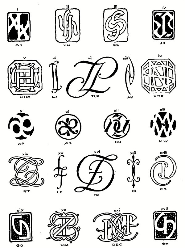 FIG. 109.—Reversible Monograms and Ciphers. The letters to be combined should be set down and studied. A H I M O T U V W X Y are symmetrical, and several of them reversible (upside down) along with N S and Z. If the given letters are included in this group it is evident that the first form, a symmetrical superimposed device, is an easy solution. Fig. 110. 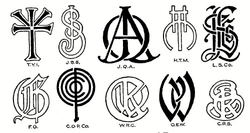 FIG. 110.—Superimposed Forms. Pairs such as CD, CO, GD, EB (script) and doubles as HH, CC, DD etc., balance left and right and suggest the possibility of symmetrical arrangement in either the first, or second, the successive, form, Fig. 111. This form is possible oftener than the first, and is usually more legible. If strict monogram is being striven for, a careful study should be made to find common strokes. Thus in M R L, Fig. 112, the M has four possible lines for use as stems for the R and L. Evidently using the first stem would give a faulty result, as in (i), reading R M L.
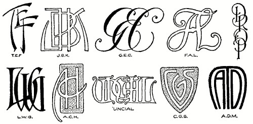 FIG. 111.—Successive Forms. 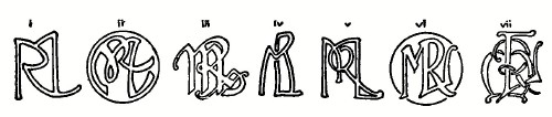 FIG. 112.—M. R. L. Illustrating Common Strokes. The free ends of each letter should be studied with reference to the possibility of connecting them into continuous monogram, Fig. 113. Sometimes free ends may be improvised as in E B. A vertical script is a useful letter for continuous forms, Fig. 115. For autograph monograms the continuous device is particularly good. After analyzing the letters in this way the designer should try the different styles of letter in little sketches, beginning with the Roman. This letter does not permit of many liberties, it is not flexible, but when one does get a good design in Old Roman it is sure to have dignity and character. If after a half dozen trials no possibilities seem to suggest themselves pass on to the Uncial, which on account of its admitting of more variation is much more amenable to treatment; and probably with the given letters there will be several suggested Uncial combinations, in both monogram and cipher, Fig. 114. 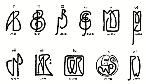 FIG. 113.—Continuous Monograms.
 FIG.
114.—O. S. U. Uncial and Gothic.
Gothic may be tried next. Old English capitals are themselves sufficiently complicated as not to invite further complication, but the simpler forms can often be worked into acceptable design in either monogram or cipher. The next form, script, is the favorite letter of the engravers. It combines much more easily into cipher than into monogram, and allows such freedom that it is safe to say that any combination may be done passably in it. 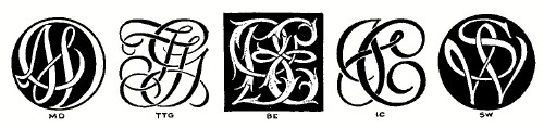 FIG. 115.—Script, Designed by A. A. Turbayne. 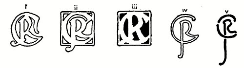 FIG. 116.—J. R. C. Various Treatments of the Same Monogram. The modern, "new art," letters offer the most attractive field for the ingenious monogram designer. The variations of form which they present, and the possibilities for originality and individuality make them the most interesting of all to play with. This style naturally suggests itself for use in the art-crafts, in etched, pierced, and stenciled work. Striking effects are secured by cutting the letters from a black background. Often a pleasing device, although not a real monogram may be made by using separated letters enclosed with good composition in some shape, Fig. 118. It may be a monogram, or initial, or even a device without letters; it need not be legible but it must be distinctive. The possession of such marks is very common among the literary and artistic people of France and Germany. 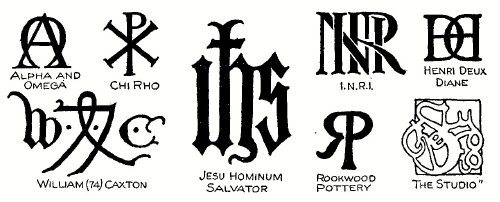 FIG. 117.—Various Historical and other Devices.
The modern cachet or mark bears much the same relation to an individual that a trade-mark does to a business house, being the stamp of individuality with which he may mark his productions or possessions.
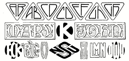 FIG. 118.—Designs with Separate Letters. M. George Auriol is the acknowledged master of this decoration, and his published drawings of these designs form two most fascinating little books. Fig. 119 shows examples of his style, the first device being his own characteristic signature. The illustrations of this chapter are selected from monograms designed by the authors (except as credited), and, with some exceptions, are in actual use; and it may be said for the benefit of the beginner who may think his initials are impossible of combination, that while some unite easily and others with difficulty, a satisfactory monogram or cipher in some style is possible with any two or three letter combination.
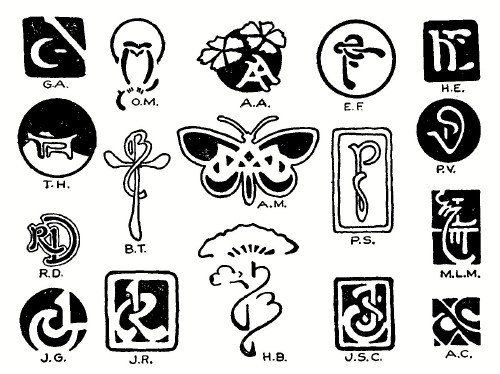 FIG. 119.—Designs by George Auriol. |
 Click the book image to turn
to the next Chapter.
Click the book image to turn
to the next Chapter.