
Web
and Book design,
Copyright, Kellscraft Studio 1999-2007 (Return to Web Text-ures) |
 (HOME)
|
|
CHAPTER
IV
SELECTION OF STYLES In lettering a drawing the style selected and the amount of time spent in its execution must be appropriate to the kind of drawing. A carefully rendered map or display drawing will require careful lettering and will permit of time for its execution, while a shop detail requires only legibility and demands speed. For Architectural Work.—There are two distinct divisions in the architect's use of letters, the first, Office Lettering, including all the titles, and notes put on drawings for information; the second, Design Lettering, covering drawings of letters to be executed in stone or bronze or other material in connection with design. The Old Roman is the architect's one general pur pose letter, which serves him, with few exceptions, for all his work in both divisions. Its characteristics have been fully discussed and illustrated in Chapter II. For titles on finished architectural drawings the Old Roman is usually drawn in outline, as in Fig. 13. Sometimes emphasis is given by running a center line in each stroke as in Fig. 48 giving it the appearance of being incised. For smaller titles and lettering on working drawings, a single stroke Old Roman, Fig. 49, based on the center line of the regular letter is much used and is very effective. It can be made rapidly and may be given much of the variety and beauty of its parent. A good deal of freedom may be taken with this letter if it is done with a real regard and feeling for its beauty. 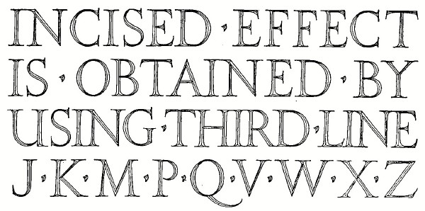 FIG. 48.—An Effective Roman Letter.
For notes on architectural drawings the Reinhardt letter is well adapted, as it is simple and legible. The key to good form is simplicity. The day of the wild letter on which the architects allowed their fancy free rein is passed. There is an individuality in lettering often as marked as in handwriting, but there must be no grossness of exaggeration, nor riot of flourishes, nor wandering of free lines.
 FIG. 49.—Single Stroke Roman. Modifications of the proportions, which are legitimate and sometimes pleasing, are often made, such as the "high-waisted" letters of Fig. 50. The architect should not attempt to design inscriptions for permanent structures until he is thoroughly familiar with letters, their construction and spacing, and knows the character and limitations of the material to be used. Letters on stone are generally incised, or sunk, in V form, and depend for, their effect not on the outline but on the shadows cast by the sides. Consequently the strokes must be wider than for the same effect when drawn on paper. This is also true for "square-sunk," and indeed for all letters which depend on shadow instead of difference in color.
 FIG. 50.—Free Modifications. The construction of Figs. 9 and 10 may be used for accurate drawings for this purpose, keeping the diameters of fillets and curves as given, but increasing the width of the strokes. If far above the eye the letters will be made taller in proportion to their width and with much wider horizontal lines than the standard form, to allow for foreshortening. In designing lettering for large inscriptions, to be cut on public buildings for example, the architects will often draw the letters to full size, each on a separate sheet, and tack them up on a wall to study the spacing. In very careful work model letters are sometimes made in plaster and studied in place. One rule must be remembered—Never crowd Old Roman. Bronze tablets are usually made with raised letters, either flat-top or modeled round. The body strokes of the letters on the tablet illustrated in Fig. 96 are 1:7 1/2, and the hair lines 2/3 of this width. In making full size design drawings for cast bronze work, a shrinkage of 1/8" in 10" should be allowed. The architect should be familiar with the Uncial and Gothic letters as given in the succeeding chapter, for use with the appropriate architectural styles. For Map Drawing.—The style of lettering on a map will depend upon the purpose for which the map is made. If for constructive purposes, such as a railroad or sewer map, the single stroke Gothic for titles and the Reinhardt for notes, are to be preferred. For a finished map, vertical modern Roman for land features, and inclined Roman and stump letters for water features should be used. The well-known maps of the Geological Survey contain good examples of this kind of lettering. For signals, signs or other lettering designed to be painted in connection with railway or other engineering, legibility is the first requirement, and no letter but the upright commercial gothic should be permitted. For Shop Drawings.—On working drawings of any kind no time may be wasted on lettering. It must be legible and uniform, sized and placed well, but executed rapidly. The single stroke capitals, either upright or inclined, for titles, and the Reinhardt for notes should be used exclusively. Roman letters, stump letters, "geometrical" letters, and shipping clerks' marking letters are all out of place. On patent office drawings the lettering is generally done in stump letters. Any draftsman who has occasion to make patent drawings should send to the Commissioner of Patents, Washington, D. C., requesting a copy of the "Rules of Practice," which gives all the requirements for drawing and lettering. |
 Click the book image to turn
to the next Chapter.
Click the book image to turn
to the next Chapter.