
Web
and Book design,
Copyright, Kellscraft Studio 1999-2007 (Return to Web Text-ures) |
 (HOME)
|
|
CHAPTER
III
COMPOSITION AND TITLES After becoming familiar with the forms of the individual letters we are ready to compose them into words and the words into sentences, and, as one reads an entire word or even a group of several words at a glance, the necessity for proper spacing of the letters and words is evidently of just as much importance as the correct formation of the letters.
 FIG. 38. In this we shall have to notice (1) the spacing of letters in words, (2) the spacing of words, (3) the spacing of lines, all of which are design problems in the disposition of white and black, and their successful solution depends on the artistic perception of the draftsman more than on any rules which might be given. In spacing letters in words uniformity of effect is gained not by spacing the letters at equal distances apart, but so that the areas of white space between the letters are approximately equal. This makes it necessary to consider the shape of each letter in connection with the following letter. Take, for example, the word LETTERING. In Fig. 38 the letters have been spaced so that the clear distances between them are equal. The effect, however, is not uniform; the first letters appear much farther apart than the last ones. But if the word be spaced taking the shapes of the letters into consideration, the L, E and T would be set closer together because of the amount of white space included between them, the two T's still closer as they have a maximum of white space under them, while between the vertical stems I and N would be left the widest space, and the G would be set a little closer than the IN as its stroke curves away from the line of the N.
 FIG. 39. Thus while no two of the letters are the same distance apart, the word appears to be uniformly spaced. A word or line should be sketched in very lightly with all the details of the letters omitted, the effect studied and the letters shifted until the appearance is uniform. When this is satisfactory, the line should be penciled more carefully and the details added. In single stroke lettering, the letters must be kept close together. The snap and "swing" of the professional draftsman's work comes largely from two things—keeping the letters full and round and close together, and the strokes to a uniform slope. The beginner's invariable mistake of cramping the letters and spacing them too far apart has already been mentioned. Words should be spaced so as to be read easily and naturally. The clear distance between words (except in compressed lettering) should never be less than a space equal to the height of the letter nor more than twice this space. For the spacing of lines, no fixed rules can be given. In the Old Roman the lines are frequently drawn very close together, sometimes closer than those in Fig. 6. The clear distance between lines of Old Roman may vary from one-third to one and one-half times the height of the letter. In inscription lettering, it is usually less than the height. For single stroke caps the space may be from three-fourths to one and three-fourths, and for single stroke lower case and stump letters two to three times the height of the body. The appearance of notes with several lines is improved by keeping the right edge as straight as possible, as well as the left. (See Figs. 30 and 33.) Paragraphs should always be indented. TITLES Every drawing should have a title, giving the necessary information concerning it in a style that conforms to its character. This information will, of course, vary for different classes of drawings, but two items are always necessary, the names and the date. Even the merest sketch should always be dated. In general, the title of a machine or structural drawing should contain: (1) Name of machine or structure. (2) General name of parts (or simply "details"). (3) Name of purchaser, if special machine. (4) Manufacturer; company or firm name and address. (5) Date; usually date of completion of tracing. (6) Scale or scales; desirable on general drawings, often omitted from fully dimensioned detail drawings. (7)
Drafting room record; names, initials or marks of the draftsman,
tracer, checker, (8)
Numbers; of the drawing, of the order. The filing number is often
repeated in the upper left hand An architectural drawing would have part or all of the following: (1) Kind of view—elevation, plan, perspective (sometimes put on different part of sheet). (2) Name and location of building. (3) Name and address of client or owner. (4) Date. (5) Scale. (6) Name and address of architect. (7) Number (in the set). (8) Key to materials. (9) Office record. (10) Signed approval of trustees or commission for public buildings. A map title would contain as many as necessary of the following items: (1) Kind—"Map of," etc. (2) Name. (3) Location of tract. (4) Purpose, if special features are represented. (5) For whom made. (6) Engineer in charge. (7) Date (of survey). (8) Scale—stated and drawn. (9) Authorities. (10) Legend or key to symbols. (11) North point. (12) Certification
In each case these items must be "displayed" according to their relative importance judged from the point of view of the persons who would use the drawing, the more important lines being made prominent by the size and arrangement of the letters.
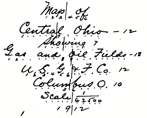 FIG. 40. The position and shape of the title will depend on the space provided or left for it. The lower right hand corner of the sheet is from long custom and on account of convenience in filing, the usual location, and in laying out a drawing this corner is reserved if possible. The shape is a matter of design. The commonest form is that of the symmetrical title which is balanced or "justified" from a center line, and of elliptical or oval outline, as Fig. 42. Sometimes the wording necessitates a pyramid or inverted pyramid form.
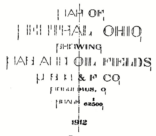 FIG. 41. In designing a symmetrical title one would first write out the arrangement on a piece of paper and count the letters in each line, counting a space between words as a letter, and, after making allowance for letters of different widths, as I and W, marking the middle of each line. Fig. 40 illustrates the first layout for the title of Fig. 42. A vertical center line is then drawn, and guide lines for letters of appropriate size for each line. The most important line is then sketched in very lightly, commencing on the center line and working to the right, making the last half of the line first and drawing only enough of the letter to show the space it will occupy. The length of this half should then be transferred to the other side and the first half sketched in. Some prefer to work this half backward from the center line, but after a little practice the first method will be found preferable. After this most important line is satisfactory in size and spacing, the other lines may be executed in the same way, and the work at this stage will be as in Fig. 41. The effect should then be studied, lines or letters shifted if necessary and the title completed in pencil.
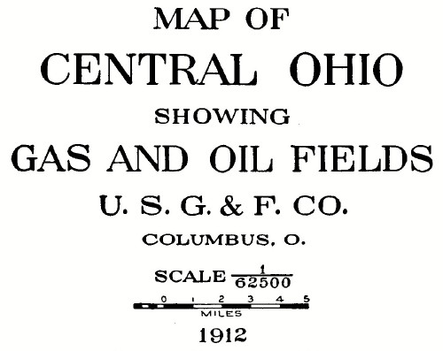 FIG. 42.—Symmetrical Title.  FIG. 43.—A Full-panel Title. As a rule, all letters should be inked entirely free hand. Sometimes, on highly finished maps or drawings for reproduction the straight lines are ruled and the curves drawn freehand, or, for large letters, the curves may be drawn with the compass or French curve. To avoid blotting, the strokes should not be filled in solid until after the drawing has been finished. The general rule, never combine vertical and slant letters in the same title, should be observed.
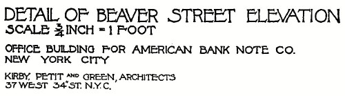 FIG. 44.—"Left Edge" Composition. The full panel title, a variation of the symmetrical form, often used in architectural work, is made by spacing the letters so that the lines are of equal length, no matter how many letters each contains. Fig. 43 is an example. The Old Roman is the only letter that permits of this wide letter spacing. Another form often used in architectural and other work is illustrated in Fig. 44. This form has a distinct advantage in not requiring careful preliminary penciling, and is therefore of value for quick sketches. Space fillers are sometimes added to give balance, but they must be handled carefully for artistic effect. Formerly titles were often made with curved lines and much elaborate ornamentation. These forms are, happily, obsolete, and any decoration or ornament is now considered as bad form. Letters should not be drawn or shaded in an attempt to make them appear to have thickness or to stand out from the paper. Punctuation marks are not necessary in a title except in case of abbreviations. 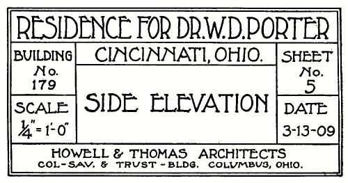 FIG. 45.—Boxed Title. The title on a working drawing is usually boxed off from the drawing as illustrated in Fig. 45. In large offices the parts of this kind of title which are common to all drawings are often printed on the tracing cloth in order to save time in the drafting room. Fig. 46 is the blank form of a well-known company. The originals of Figs. 45 and 46 are about five inches long, on sheets from 18 to 30 inches. A form of title which is growing in favor is the "record strip," a narrow strip marked off entirely across the lower part of the sheet, containing the information required in the title, and space for record of orders, changes, etc. The general arrangement of such a title is shown in Fig. 47. In shop drawings it is often printed in blank on the paper or cloth to be used. The lettering on all such titles is done very quickly in single stroke, often without preliminary penciling. 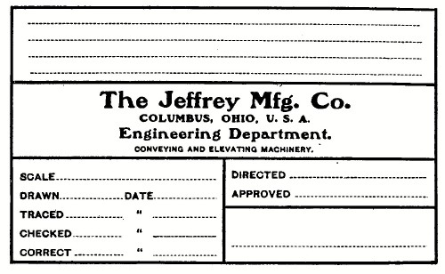 FIG. 46.—A printed Title Form. 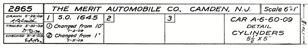 FIG. 47.—A Record Strip. |
 Click the book image to turn
to the next Chapter.
Click the book image to turn
to the next Chapter.