
Web
and Book design,
Copyright, Kellscraft Studio 1999-2007 (Return to Web Text-ures) |
 (HOME)
|
|
CHAPTER
II
LETTER CONSTRUCTION General Proportions.—Before combining letters into words we must be familiar in detail with the forms and peculiarities of each letter. Letters vary in their proportion of width to height. Not only are the widths of the different letters in the same alphabet very unequal, but different alphabets vary in their "measure," some being tall and narrow, others short and wide. There is a certain proportion or appearance as in the ordinary printed or drawn letters which may be called normal or standard. The styles whose widths are less than these in proportion are called compressed or condensed, and those whose widths are greater are known as expanded or extended. There is also in the different styles a wide variation in the proportion of the thickness of the stem or stroke of the letters to their height, ranging all the way from 1/3 to 1/16. Letters with heavy stems are called Bold Face or Black Face, and those with thin stems, Light Face. There is an optical illusion well known to all designers, in which a horizontal line drawn across the middle of a rectangle appears to be below the middle. In order that the divisions may seem to be symmetrical such a line must be drawn above the middle. In the construction of letters this illusion must be provided for in what may be called the "rule of stability." In order to give the appearance of stability such letters as the B E K S X and Z, with the figures 3 and 8 must be drawn smaller at the top than the bottom. To see the effect of this illusion turn a printed page upside down and notice the letters mentioned. Another optical illusion which must be provided for in large carefully drawn letters is that a round letter of the same height as an adjacent square letter will appear smaller, as it touches the guide line at only one point. In order to give the appearance of equal height, the round letters must be extended a trifle over the guide line on top and bottom. This is also true in regard to the pointed ends of the angular letters. A letter coming to a sharp point at the guide line will appear smaller than its companions. The point may either be extended over the line, or cut off as in Fig. 14. These are delicate refinements and any exaggeration of them is much worse than not observing them at all. A letter drawn in outline will not appear to have the same proportion of stem to height as one of the same width of stem made solid, because in the first instance the eye sees the enclosed area and in the second sees the outside. On this account a letter which is to be filled in solid should be outlined in ink so that the outside edge of the ink line touches the penciled outline. These general proportions and peculiarities are true of all styles. In this chapter we shall consider the two fundamental styles, the Roman Capitals and the Commercial Gothic. THE ROMAN LETTER The Roman is the foundation letter. Although there are countless variations of it, there may be said to be three general forms, the early or classic, the renaissance, and the modern. The classic and the renaissance are very similar in effect, and the general term Old Roman is given to both. Type based on this form is called by the printers "Roman Oldstyle," and that based on the modern form, simply "Roman." With the newer faces of type, however, this distinction is not so significant. The
Roman letter is composed of two weights of lines, corresponding to
the down stroke and the up stroke of the broad reed pen with which it
was originally written; and from this we can formulate a rule
which will prevent the inexcusable fault of shading a letter
incorrectly. With twenty centuries of established form as precedent,
it is, from the standpoint of design, as bad to shade a letter on the
wrong stroke as it is to reverse it or to misspell the word in which
it occurs. To determine the accented lines, we have then simply to
draw the letter in one stroke and note which lines were made
downward.
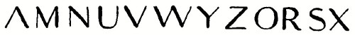 FIG. 3. It will be noticed that all the inclined shaded strokes with the exception of Z are downward from left to right (\) which makes a secondary or supplementary rule applicable to X and Y. RULES FOR SHADING ROMAN LETTERS (1) Heavy Lines—all down strokes. This includes all vertical lines (except as noted above in M, N, and U), and all lines slanting downward, left to right. (2) Light Lines—all horizontal strokes. All strokes upward from left to right (except Z) In the Roman letter the heavy line (a) is called the stem or body mark, the light line (b) the hair line, the cross stroke (c) which finishes all free ends the serif, and the curves (d) connecting the serifs with the stem, brackets or fillets.
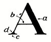 FIG. 4.
THE
OLD ROMAN
Of the many existing inscriptions of the early Roman period, that at the base of the Trajan Column at Rome (114 A. D.) may be taken as a typical example. Fig. r is a photograph of a portion of the inscription, and Fig. 5 an alphabet drawn carefully from this great classic example.
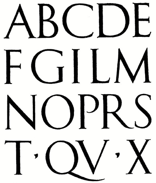 FIG. 5.—Classic Roman. Drawn from the Trajan Column. OLD ROMAN (RENAISSANCE) 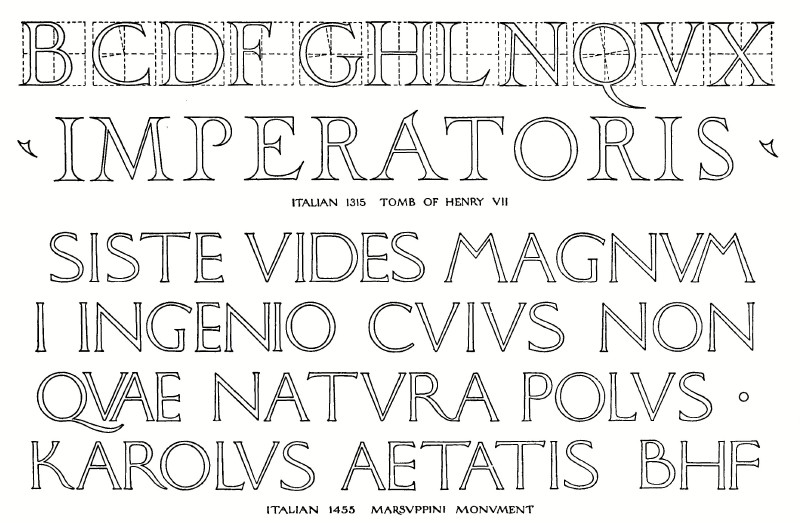 FIG. 6.—Two Examples of Renaissance Roman. At the time of the Italian Renaissance the architects went to the old Roman models for their letters, modifying and refining them. Fig. 6 illustrates two famous examples of Mediaeval Roman, differing widely in appearance, the Henry VII having the largest serifs that would ever be used, and the Marsuppini very small ones. The Old Roman is a light face letter, the body stroke being one-eighth to one-tenth of the height of the letter, and the hair line from two-fifths to two-thirds of the width of the body stroke. In the proportion of width to height the Old Roman alphabet may be divided into two parts, the wide letters and the narrow letters, and it is the combination of these that gives the variety and beauty to this style. The division is as follows:
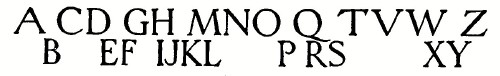 FIG. 7. In the Renaissance Old Roman the narrow letters are sometimes wider in proportion than those of the early period, but the above division is still very evident. J, U, Y, and Z are letters of a later period than the rest of our alphabet. J was not differentiated from I until the sixteenth century, and hence in designing strictly classical inscriptions I is sometimes used for J. Similarly, the curved U is of later introduction, the sharp V being used for it until comparatively recent times. In careful Old Roman lettering, therefore, it is entirely in keeping to use V for U if the legibility is not affected. Its indiscriminate use however, as for example on office drawings should be avoided. Such use is often pure affectation. Some in order to preserve legibility without using the U form, adopt the manuscript form u, as in Figs. 99 and 101. The beauty of the Roman letters depends not a little upon the appearance of the serifs and spurs which terminate every free end. These originated, probably, from a chisel cut made across the end to prevent over-cutting, and were copied by the penmen on account of the finished appearance which they gave. They are connected to the stems by small curved fillets or brackets, and great care must be observed in drawing these curves. If made even a trifle too large, the appearance of the letter is badly marred. Fig. 8 shows in detail several forms of these terminals. (a) is the serif of the classical Old Roman. (b) a longer serif as found on some renaissance examples. (c) the serif on the hair line of the A, M, and N. (d) top and bottom spurs on horizontal lines, such as E and T. The requirements for proficiency in lettering are, first, an intimate and critical knowledge of the letter forms, second, and more important, the feeling for composition, which can be gained only by continued observation and practice. Although difficult of execution both in individual form and in composition, the Old Roman as the foundation letter must be studied first by those who are interested in lettering as an art. Those who wish only to acquire the ability to letter a shop drawing legibly and correctly may use the time available with the single stroke letters of pages 23 and 26 alone, but with such, even a slight knowledge of the historical forms will greatly increase the power of appreciation of the beautiful in lettering. It is assumed that the student is familiar with the use of the ordinary drawing instruments. While lettering is not mechanical drawing, a T square, triangle and dividers are necessary adjuncts. In penciling, a very light free sketchy line should be employed, and the use of a very hard pencil avoided. The beginner's usual mistake is in cutting into the paper with hard wiry lines that cannot be erased and that hinder the motion of the pen. A 2H pencil sharpened to a long conical point is in general the best. Figs. 9 and 10 contain a carefully drawn Renaissance Roman alphabet. The stems are one-ninth of the height of the letter, and the hair lines one-half the width of the stems. The width of each letter is given in units, the unit being one-ninth of the height of the letter. A scale should be made by dividing the height into nine parts and marking these divisions on the edge of a strip of paper or a card. The fine-line circles and geometrical construction shown on this plate are given for use in drawing the letters to large size for architectural, and other purposes and will be described later.
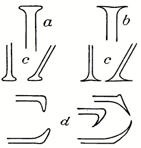 FIG. 8.—Serifs. 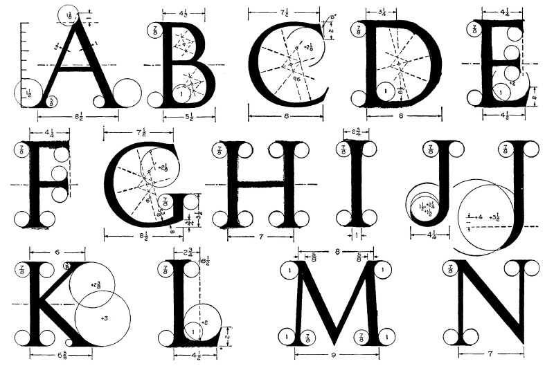 FIG. 9.—Roman Alphabet (first half), with a Method of Geometrical Construction for Large Letters. 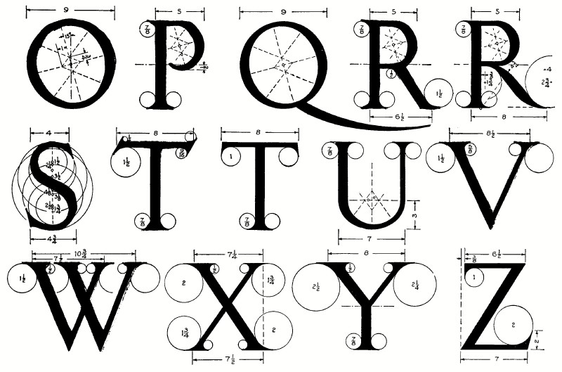 FIG. 10—Roman Alphabet (second half) with a Method of Geometrical Construction for Large Letters.
In studying this alphabet, top and bottom guide lines and a center or waist-line should be drawn, making the letters not less than one inch high, preferably much larger, and the letters drawn in outline, freehand, fixing the proportion and characteristics of each letter firmly in the mind. The letters on this plate are given in their alphabetical order for convenience, but in studying them it is well to take them in their family order as given in Fig. 13, and learn the relationships.
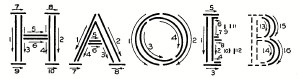 FIG. 11.—Typical Order and Direction of Strokes. The widths should be marked off from the paper scale and the letters sketched, keeping the stems of uniform width, following the general order and direction of strokes outlined in Fig. 11, always drawing the outlines of the main strokes of the letter first, then the serifs, and finally the fillets. The analyzed H is typical for all the straight letters. The letters with inclined sides should have the outside lines made first as in the A of Fig. 11. In the O family the outside curves of the O, Q, C, and D are circles and when done freehand should be drawn in two strokes as shown in Fig. 11. The inside curve is an ellipse, usually tilted at an angle as indicated. 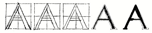 FIG. 12.-Stages of Construction. The narrow curved letters B, P and R are sketched by first drawing the main stem, then starting the horizontal lines, then marking the extreme points of the curve. The inside lines of the curved strokes may be made before the outside, as the beauty of these letters depends largely on the shape of the enclosed space of the background. In inking the Old Roman as a solid freehand letter, a rather coarse writing pen should be used, and it is better to ink a broad line down the inside first (using a brush for large letters) and build out to the outline, as shown in Fig. 12, rather than to ink in the outline and fill in.
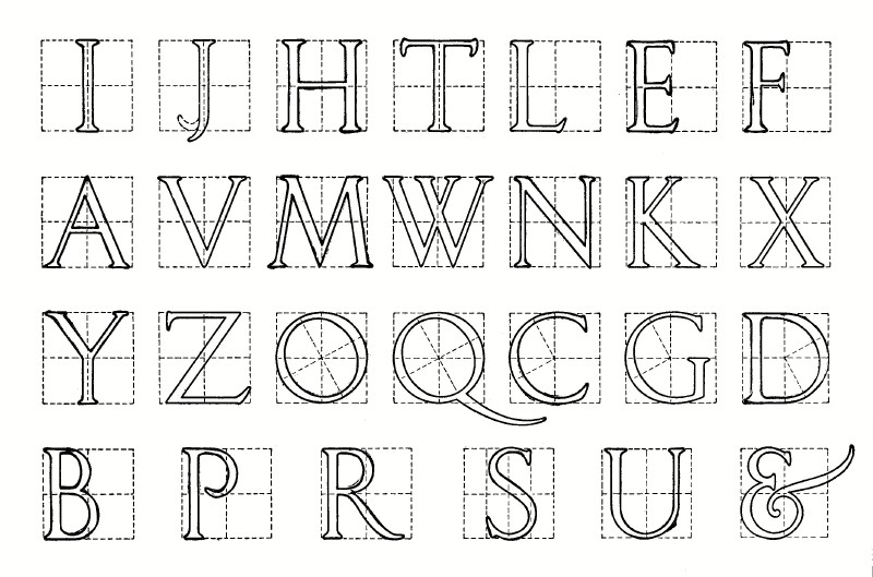 FIG. 13.—A Short Serif Roman Alphabet, Constructed on Squares.
The ampersand (&) is a monogram of the Latin word et. It is made in a great variety of forms, the one in Fig. 13 being an early form which shows clearly its derivation. Fig. 13 is another Roman alphabet, grouped in family order, and with the letters enclosed in squares to show their proportions. The serifs on this letter are shorter and thicker, suitable for raised letters in stone or metal. In drawing them great care must be exercised to avoid any exaggeration of this shape, and the getting of a club-footed effect. A description of the method of drawing Roman letters in single stroke with a broad pen is given in Chapter V, page 44. Mechanical Construction.—Occasions will arise, such as in the design of inscription lettering, when it will be necessary to construct letters accurately with drawing instruments. Leonardo da Vinci published a book in 1514 with a beautiful alphabet constructed geometrically, and several other noted mediaeval architects and writers followed with other constructions, some very complicated. The construction given in Figs. 9 and 10 is on the order of these great precedents, but is made for practical use, and it is believed, will be found very easy to follow. The modulus or unit is one-ninth of the height and all the dimensions are given in terms of this unit. The stems, as has been stated, are one unit wide and the light lines one-half unit. All the fillets on vertical stems have a radius of seven-eighths of a unit. The small figure in all the other circles is the radius in units. The ellipses of the inside lines of the curved letters are made with four centers with the construction shown in the dotted lines. The dimensions for this construction are shown in the O, Fig. 10, and are the same for all the letters, the angle of tilt being 15 degrees, and the radii of course being found by marking the thickness of the stems from the outside curve, which is always a circle. In constructing these letters for execution in stone the comment on page 40 should be observed. This geometrical construction is given as a close mechanical approach to the forms of the letters. No mechanical construction, however, can impart the subtlety and character of the freehand curves. THE
MODERN ROMAN
In the eighteenth century modifications were introduced by some of the type founders which resulted in the letter in common use now in our books and newspapers, and which we have called Modern Roman. This modern form has lost all the variety and beauty of its old prototype, is essentially inartistic and of absolutely no value in design, as in the attempt for uniformity it has become only mechanical and monotonous, but it is the standard letter of our government in the bureau of engraving and printing, coast survey, topographic survey, and geological survey, and is in general use throughout the country for maps and similar work; it therefore must be mastered thoroughly by all civil engineering students. It is generally made with a much heavier face than the old Roman, a usual proportion of width of stem to height being one to six, with comparatively very light hair lines and long serifs. This violent contrast, while it may give some effect of delicacy or refinement, reduces greatly the legibility of the letter at a distance. Figures 14 and 15 contain the alphabet and numerals of the Modern Roman, drawn in a slightly expanded form, which is more pleasing for ordinary work than the compressed or even the standard form. Using the width of the body stroke as a unit, the letters are six units high, and the width of each letter is indicated by the dimension in units. A convenient scale to mark off these dimensions may be made on the edge of a card or strip of paper. The order and direction of strokes are indicated on each letter, and should be followed carefully. As is usual in freehand drawing, all vertical and inclined lines, and curved lines, are made downward, and all horizontal lines from left to right. The strokes of each letter should be studied and the letter practised over and over until the student is perfectly familiar with it. The Roman letter is difficult and it is only by strict attention to details that it can be mastered. In large letters an optical illusion similar to those mentioned on page 4 may be provided for. The width of the thickest part of a curved letter, as the O, in order to appear to be of the same thickness as the stem of a straight letter, should be made a very little wider. This variation is only " the width of a line," and must not be exaggerated.
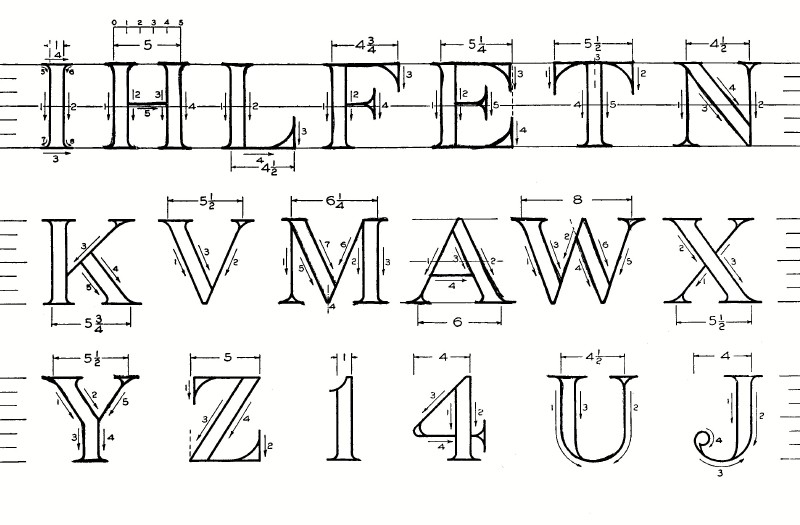 FIG. 14.—Construction of Modern Roman Letters and Figures. 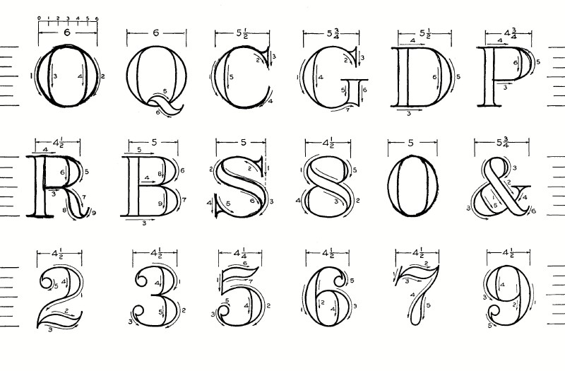 FIG. 15.—Construction of Modern Roman Letters and Figures. The curve of the round letters is not circular as in the Old Roman. Taking the O as typical the outside line is flattened slightly at the diagonals, as if it were made up of four curves at the extremities of the axes, and these connected by four longer curves, as illustrated in Fig. 16. This is characteristic of all the curved letters, and the observance will give a grace to the letters otherwise not obtainable.
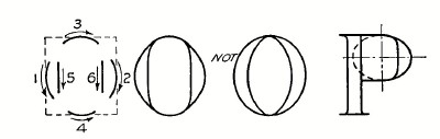 FIG. 16.—Curve Shape in Modern Roman.
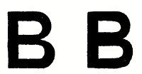
The inner line is nearly straight, and connected to the outer by a transition curve. Great care must be used to avoid the crescent shape of Fig. 16. The appearance of the Modern Roman is marred oftener by poor serifs than in any other way. Correct and incorrect serifs and spurs are shown in enlarged form in Fig. 17. This figure also indicates that the terminal ball of the J, 2 etc., is a circle joined to the stem by a small fillet. At (f) is shown the cusp or intersection of the curves of R and B, illustrating the rule that two heavy strokes must never touch each other. It will be noticed that the numerals 2, 5, and 7 are exceptions to the rule that horizontal strokes are light. 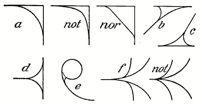 FIG. 17.—Modern Roman Serifs. In practising the alphabet three horizontal guide lines should be drawn, the top, bottom and waist lines, as shown in the upper line of Fig. 14 and the letters penciled lightly using the 2H pencil, with sharp conical point, always adding the serifs and fillets last. In inking smaller sizes, the same order of strokes should be observed. For larger letters the inking should be done as described for the Old Roman, working out from a broad rough stroke between the lines. In letters smaller than 1/4” the fillets on the serifs of the body strokes become so small that it is best to omit them. In very careful map work and the like the straight lines are sometimes inked with the ruling pen, and the curves added freehand. THE COMMERCIAL GOTHIC There is an unfortunate confusion about the term "Gothic" as applied to letters. All paleographers and art students apply the word, rightly, to the manuscript forms of the eleventh to the fifteenth centuries, written with a tilted pen and changing from the curved lines of the early or round Gothic to the angular of the later forms. But in this country the word Gothic is taken universally by printers, engravers, lithographers, and sign writers to mean the plain bold letter made with uniform strokes and without serifs. (In England the letter is called sans-serif.) Since the word is in such general favor by those who use letters commercially, we have called this style "Commercial Gothic." It has sometimes been called Egyptian, and in the U. S. Coast and Geodetic Survey, it is known as Block Letter. This letter should be used wherever boldness and legibility are of more concern than finish. Without the refinement and delicacy of the Roman, it is more easily made, and in "single stroke" form is used more on working drawings than all other styles together. Figures 18 and 19 show the letter drawn with the thickness of stem one-sixth of the height, and in width a trifle expanded. In these plates a very slight "spur" has been added. In large brush or pen-made letters this spur adds materially in relieving the stiffness of appearance. For very bold, heavy effect, the stems may be made one-fifth the height. Strokes much thicker are not good except in special cases. This letter is best drawn in outline first and filled in solid, instead of building it out as the Roman, and much care must be exercised in keeping the stems to uniform width. Failure to observe this rule results in a very unpleasant appearance, as in Fig. 20. The order and direction of strokes for the outline letter is in general similar to the Roman already given, as may be seen from the typical examples analyzed in Fig. 21.
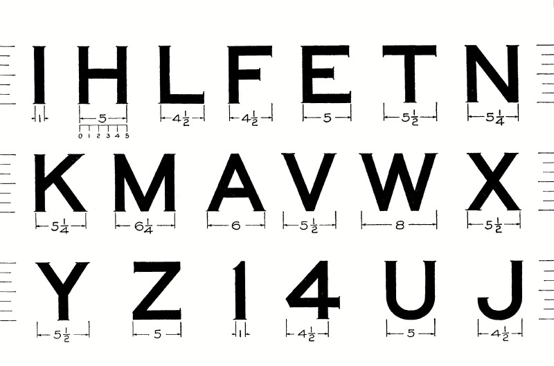 FIG. 18.—Spurred Commercial Gothic. 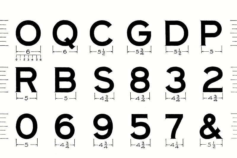 FIG. 19.—Spurred Commercial Gothic.
In the practice of this letter, guide lines as shown in the upper line of Fig. 14 should be drawn. It will be noticed that O is made a trifle "full" to avoid the bull's-eye effect of the exactly circular shape. This is just the opposite of the rhomboidal shape of the Roman O of Fig. 16.
 Incorrect FIG. 20.
SINGLE
STROKE LETTERS
By far the greatest amount of lettering on drawings is done in "single stroke" or "one stroke" letters, either vertical or inclined, and every engineer must have absolute command of these styles. The ability to letter well and rapidly can be acquired by any draftsman, but it requires much careful practice with strict attention from the outset to the form and proportion of each letter, to the sequence of strokes. and to the rules for composition. The term " single stroke" does not mean that the entire letter is made without lifting the pen, but that the width of the stroke of the pen is the width of the stem of the letter. For the desired height, therefore, a pen must be selected which will give the necessary width, and for Gothic letters one which will also make the same width of line when drawn horizontally, obliquely or vertically.
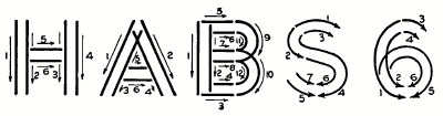 21.-Typical Order and Direction of Strokes.
Leonardt's ball point 506F or 516F will make a line of sufficient width for letters 1/4" high, which is as large as would be used on an ordinary working drawing. For 3/16" letters 516EF or Gillott's 1032 are suitable, for smaller sizes Hunt's shot points, Gillott's 1050, 404 and 604 may be used. For single stroke letters larger than 1/4", the Payzant pens and Shepard pens are useful. The ruling pen should never be used for lettering. A coarse lettering pen may be made from an old ruling pen by rubbing its points very blunt and grinding a smooth ball end on them.
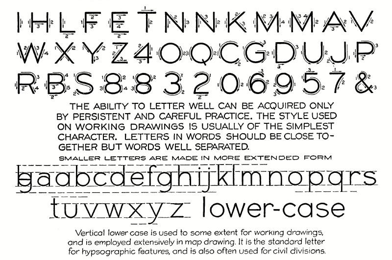 FIG. 22.—Analysis and Composition of Upright Gothic. Some draftsmen prepare a new writing pen by dropping it in alcohol, or by holding it in a match flame for two or three seconds, and some break it in further by writing a word or two lightly, on a hard Arkansas oil stone.
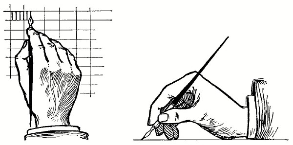 FIG. 23.—Position for Single Stroke Lettering. Single Stroke Vertical Caps.—The upright single stroke "commercial gothic" letter shown in Fig. 22 is a standard letter for working drawings of all descriptions. It is the letter of Figs. 18 and 9 with lighter face. The analyzed letters of Fig. 22 are drawn to such proportion that roughly each fills a square space. In the proportion of width to height a general rule is that the smaller the letters the more extended they should be. A low extended letter is more legible than a high compressed one and at the same time makes a better appearance. This letter is seldom used in compressed form. Before commencing the practice of this alphabet, some time should be spent in preliminary practice to gain control of the pen. It should be held easily as in writing, the strokes drawn with a steady, even motion, and a slight uniform pressure on the paper, not enough to spread the nibs of the pen. For the first practice, draw in pencil the top and bottom guide lines for 1/4" letters and with a 516F ball pointed pen make directly in ink a series of vertical lines, drawing the pen down with a finger movement in the position shown in Fig. 23. This one stroke must be practised until the beginner can get lines vertical and of equal weight.
 FIG. 24.—Practice Strokes. Remember that it is drawing, not writing, and that all the flourish movements of the penman must be avoided. It may be found difficult to keep the lines vertical, if so, direction lines may be drawn, as in Fig. 23, an inch or so apart to aid the eye. It is ruinous to the appearance of upright letters to allow them to slant forward. A slight backward slant is not so objectionable, but the aim should be to have them vertical. When this stroke has been mastered, the succeeding strokes of Fig. 24 should be taken up. These strokes are the elements of which the single stroke letters are composed. After sufficient practice with them, they should be combined into letters in the order of Fig. 22, penciling in one pattern letter and numbering its strokes, then drawing directly in ink several beside it. Care must be taken to keep all angles and intersections clean and sharp; getting too much ink on the pen is responsible for appearances of the kind shown in Fig. 25.  FIG. 25.—Too much Ink. Single Stroke Inclined Capitals.—The single stroke letter inclined to a slope of between 60 and 70° is preferred by perhaps a majority of draftsmen. Professor Follows in his dictionary1 says: "The writer believes that for mechanical drawing, sloping lettering is better than vertical. An argument used by those who favor vertical lettering is that there is only one vertical as against any number of slopes, and that it should therefore be easier to teach and get uniformity with the vertical lettering. But as a matter of fact, it is probably easier to get a sufficiently uniform slope than a sufficiently exact vertical, because a very slight deviation from the vertical is noticeable. In the average mechanical drawing there are so many truly vertical lines to compare with that the eye more readily detects a deviation from the vertical than from any given slope. Then, again, the sloping lettering stands out more clearly by contrast with the vertical and the horizontal lines of the drawing." The order and direction of strokes for the capitals of this form are the same as in the upright form, but these letters are usually not extended. A common slope for the inclined letters is to the proportion of 2 to 5, giving an angle of 68°+, which may be made by laying off two units on a horizontal line and five on a vertical line. Triangles of 67 1/2° are sold by the dealers and are very convenient. In rapid lettering some find it easier to use a somewhat greater slant (as much as 60°).
INCLINED SINGLE STROKE GOTHIC 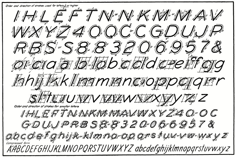 FIG. 27.—Analysis of Strokes for Single Stroke Inclined Caps and Lower-case.
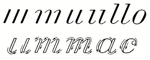
If a rectangle containing a flexible O should be inclined, the curve would take the form illustrated in Fig. 26, sharp in the upper right-hand and lower left-hand corners, and stretched flat in the other two corners. It is the observance of this characteristic that is the secret of success with inclined letters.
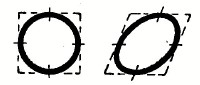 FIG. 26. 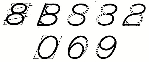 FIG. 28.—Relationships.
Fig. 28 illustrates this principle with the curves used in the S family, showing the directions of the major axes of the ellipses formed. The close relationship of the B, S, 8 and 3 should be noted. The second line of Fig. 28 shows the relationship of the o, 6, and 9. The cipher it will be noted is narrower than the 0, and the back-bone of the 6 and 9 are made of the same curves.
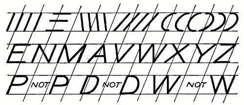 FIG. 29.—Practice Strokes, with Direction Lines. 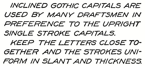 FIG. 30.—Composition. In practising the inclined letters the top and bottom guide lines should be drawn, and a sufficient number of direction lines at the given angle to keep the letters to a uniform slope. This slope must be observed with particular care in the case of the letters with sloping sides as A, W, etc., whose lines must make equal angles on each side of the direction line, as shown in Figs. 27 and 29. Fig. 30 illustrates the appearance of this letter in paragraph composition. Single Stroke Inclined Lower-case. — Thus far our discussion has been entirely on capital letters. The minuscule or lower case letters of the Roman and upright gothic are very rarely used on working drawings because of the difficulty of execution. It is desirable, however, to have a lower-case letter for notes on drawings on account of the increased legibility, as we read words by their word-shapes and are more familiar with these shapes in lower-case letters. Paragraphs printed entirely in capital letters are monotonous in form and hard to read. The one letter to use for this purpose is the single stroke inclined letter, called the Reinhardt letter in honor of Mr. Charles W. Reinhardt of the Engineering News whose work has for a generation been admired by draftsmen, and who first reduced the style to a system in his well-known book "Lettering for Engineers." This letter is the minuscule reduced to its lowest terms, omitting all unnecessary hooks and appendages. It is very legible, and after its swing has been mastered can be written very fast. These letters are used with the inclined gothic capitals and are made with bodies two-thirds the height of the capitals, the ascending letters bdfhklt extending to the height of the capitals and the descenders gjpqy dropping the same distance below.
 31.—Basis of Reinhardt Letter.
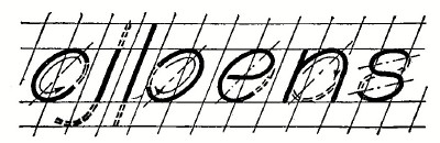
All the letters of the Reinhardt alphabet are based on two elements—the straight line, and the ellipse whose conjugate axes are the slope line and the horizontal line, and consequently whose major axis is about 45°. Fig. 31. The general direction of strokes is always downward or from left to right, and their order is given in the last three lines of Fig. 27. The effect of this letter depends almost entirely on the uniformity of slope, and constant care must be observed to keep the strokes parallel.
 FIG. 32. Draw top and bottom guide lines, and slope lines, and practice the O as the basis of the curved letters, until a certain rhythm and swing has been acquired, the pen moving faster in the middle of the stroke than at the sharp extremities. Then take up the letters as given in Fig. 27, noticing the order and direction of strokes, and swinging them to the mental count of one, two, one, two.
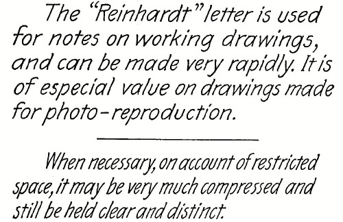 FIG. 33.—Composition (Drawn, by C. W. Reinhardt). 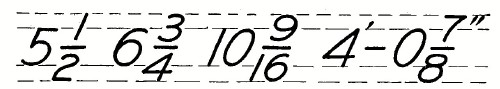 FIG. 34.—Fractions. As soon as the shapes of the letters have been learned in this way the entire practice should be devoted to their composition into words and sentences. In this the one rule must be remembered—Keep the letters close together, and with full, uniform bodies. The beginner's invariable mistake is to cramp the letters and space them too far apart, Fig. 32. Words should be separated to a distance about equal to the height of the letter. Paragraphs are always indented. Fig. 33 is an example of spacing of letters, words and lines. Special attention should be paid to the practice of the numerals, getting them round and full-bodied. Fractions are made with a horizontal line and extending over the guide lines as shown in Fig. 34.
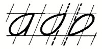 FIG. 35. LETTER
CONSTRUCTION
A variation of the Reinhardt letter, known as the "pumpkin seed" letter is preferred by some draftsmen. In it the curves of abdgpq are pointed instead of elliptical, as in Fig. 35. The remainder of the alphabet is the same as the Reinhardt. ITALICIZED ROMAN AND STUMP LETTERS 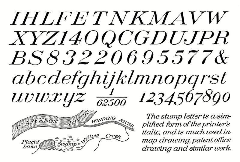 FIG. 36.—Inclined Roman, with Stump Letters for Lower-case. INCLINED
ROMAN CAPITALS
The inclined or italicized form of Roman capitals, as shown in Fig. 36, is used for water features on maps and as capitals for the stump letters which follow. It is made with a fine flexible pen, the very small sizes in one stroke, springing the pen for the shaded lines, the large sizes by making two strokes for the stems and following the same orders as in Figs. 14 and 15. In letters less than 1/4" high, brackets on the serifs of the body marks should not be attempted. Alternate forms of the numerals, 2, 5 and 7 are shown. STUMP
LETTERS
The stump letter is a simplified form of the printer's italic, and is much used in map drawing, patent office drawing, and other careful work. It is more difficult than the single stroke letter of Fig. 27 and requires much more time for its execution, consequently it should not be chosen except for display work. A fine flexible pen should be selected—for letters from 1-20" to 1-10" high, the Gillott 290 and 291, 1-10" to 2-10" Gillott 170, for larger ones, Gillott 303. Except for the smallest letters, two strokes should be used for the shaded lines. In this, as in all the slant letters, the first requirement is uniformity of slope and width of line. The hair lines may be made either with the same stroke as the body, or added with a quick down stroke. This second method is preferred by some draftsmen as it prevents the blur in the angle which sometimes occurs with a sharp pen and paper whose fibre is apt to catch. The strokes of Fig. 37 should be mastered before attempting to draw the letters.
 37.—Practice Strokes for Stump Letters. 1 Universal Dictionary of Mechanical Drawing. G. H. Follows, 1906. |
 Click the book image to turn
to the next Chapter.
Click the book image to turn
to the next Chapter.